Not Found
Not Found
Not Found
Not Found
Request path contains unescaped characters
Not Found
Not Found
Not Found
Not Found
Not Found
Not Found
Not Found
Not Found
Not Found
Not Found
Not Found
Not Found
Not Found
Not Found
Not Found

Submitted

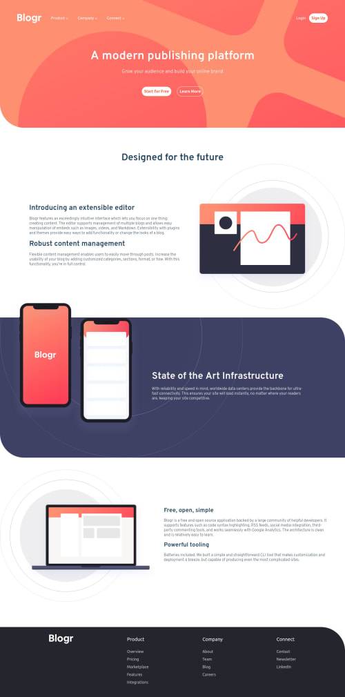
Blogr landing page with HTML, CSS Grid/ Flex, JavaScript

@Duyen-codes

Desktop design screenshot for the Blogr landing page coding challenge

This is a solution for...

  • HTML
  • CSS
  • JS
2junior
View challenge

Design comparison


SolutionDesign

Solution retrospective


I really need help with the unsolved: -header gradient background, when adding the second background with hsl, the background pattern disappeared, but with rgba(in this case i use kind of purple, it shows) -JavaScript for toggling navbar menu, burger icon and arrow icon, the menu showed very quickly and disappears right after that. It doesn't stay. -phones image stretches the whole container in art section and I don't know why.

Please tell me what I did wrong! I know there are other minor details that need to be fixed but for now I think about the above. Thanks a lot!

Community feedback

Rafal 1,395

@grizhlieCodes

Posted

Real nice solution so far apart a few minor things you already mentioned :)

I'll makes notes one by 1 and reply to this comment chain as I spot stuff 👍

Your burger-icon should be a button as it activates some JS and doesn't take the user anywhere in reality, instead it opens up a modal. Because it's currently a link it refreshes the page every time you click it, hence the menu showing up for 1 second. If you look at the browser icon on the top you'll see that the page is refreshing.

Marked as helpful

0

@Duyen-codes

Posted

@grizhlieCodes -thanks! solved!

0
Rafal 1,395

@grizhlieCodes

Posted

@Duyen-codes For the background issue:

/*This works for me, tested on desktop. I moved the image to the front, linear to the back, not colour accurate to the design btw, I just threw in some numbers so I could see the gradient properly hehe*/

header {
     background: url(./images/bg-pattern-intro-desktop.svg), linear-gradient(to  bottom right, hsl(13, 100%, 72%), hsl(360, 100%, 72%))

}
0
Rafal 1,395

@grizhlieCodes

Posted

@Duyen-codes I can't spot what the issue with phone-image is. Perhaps I don't understand the problem?

0

@Duyen-codes

Posted

@grizhlieCodes This bg issue been solved! Thanks a lot!

1

@Duyen-codes

Posted

@grizhlieCodes In the design:

  • on desktop, the phone on the right has a bit of bottom being outside of the dark purple background -on mobile, both phones half stay inside of the purple background, half is outside.
0
Rafal 1,395

@grizhlieCodes

Posted

@Duyen-codes Ohhhh. I sort of ignored the design like an idiot :)

Ok gotcha. Well there's multiple solutions for this.

The important thing to understand is how your .art-container is settings its height. At the moment the one thing setting this height is the img basically. So our goal here is to potentially set a max-height on .art-container so it doesn't grow beyond a certain point.

This goes back to what I was talking about yesterday. Don't set height if you can avoid it. But min-height and max-height will be tremendously useful as it can help us follow designs a bit more closely if you know that the text contained won't overflow etc.

Because this change is for desktop size we can be sure that us setting a max-height won't mess anything up.

Set max-height: 400px; for your .art-container.

Then remove position: relative; top: -80px; from the img.

This should work. The 400px is a random amount I chose, choose whatever is closest to the design, I just eye-balled it.

So now our container wants to grow because of the image but it can't beyond the max-height we set. Our image will be its' original size in pixels because we haven't set any width/height for it. And it will overflow nicely.

This could be further improved but it's A WAY you can achieve this with very little work for the desktop view. If you need a more robust solution I'd recommend using display: grid; on your .art-container and just making a grid that contains everything. In fact I would personally use grid.

Marked as helpful

0

@Duyen-codes

Posted

@grizhlieCodes Right, I tried the first approach you suggested. Setting max-height of 400px for desktop view seemed to solve the problem in desktop. On mobile, it does not. I'll try to use grid as you suggested. But tbh, I am not really sure how to make the phones position as design with grid either.

0
Rafal 1,395

@grizhlieCodes

Posted

@Duyen-codes Don't worry. Try the grid approach and I'll build one as well when I get a moment during my free time. You can compare etc. Might make it into a video in the end since it's a common problem to solve and perhaps just share my process/thinking as I build it. Will reply here once I build the codepen.

Marked as helpful

0

@Duyen-codes

Posted

@grizhlieCodes Thanks a lot! I am looking forward to your finished project. I'll try to complete on my own meanwhile as much as I possibly can. If only you were my mentor :)

0
Rafal 1,395

@grizhlieCodes

Posted

@Duyen-codes Not the worst idea. Could be a good way of me knowing what I don't know (explaining something well = knowing, not being able to explain it = not knowing).

Feel free to add me on discord if you have it:

Grizhlie#4547

0
Rafal 1,395

@grizhlieCodes

Posted

@Duyen-codes https://codepen.io/grizhlie/pen/poWENeB?editors=1100

Quick demo of grid for that mobile image and some text. Firefox is the best browser when it comes to understanding CSS btw, I highly recommend it.

Marked as helpful

0

@Duyen-codes

Posted

@grizhlieCodes Thanks! I'm reading the codes and trying to understand them. You're awesome!

1
Rafal 1,395

@grizhlieCodes

Posted

@Duyen-codes All good. Take your time with grid, it's an amazing tool.

Marked as helpful

0

@Duyen-codes

Posted

@grizhlieCodes Yeah I cant agree with you more on that! I'll take my time with it. Thanks again.

0

Please log in to post a comment

Log in with GitHub
Discord logo

Join our Discord community

Join thousands of Frontend Mentor community members taking the challenges, sharing resources, helping each other, and chatting about all things front-end!

Join our Discord