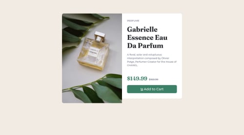
Bootstrap framwork

Solution retrospective
This is my solution to the challenge. Any tip that can improve my code will be appreciated please.
Please log in to post a comment
Log in with GitHubCommunity feedback
- @PipouwPieuw
Hello there, good job completing this challenge!
I have a few suggestions that could improve your page:
- The white background should have the same height as the image. Putting a background on
.productinstead of.descriptionwould fix this. - Instead of using fixed margins to center the content, you can do it with flexbox like this:
.container-fluid { display: flex; justify-content: center; // Centering horizontally align-items: center: // Centreing vertically min-height: 100vh; // To make the container at least as tall as the screen }- A better way to handle responsive images is the <picture> element which allows you to enter multiple image sources and display them one at a time based on screen size. Here's a page explaining how it works.
Overall you did a good job, keep it up! :)
Marked as helpful - The white background should have the same height as the image. Putting a background on
- @Kiburstgr
Great work. It is pretty much a perfect match. You did a great job importing the fonts too. A couple things that you might want to check out are the attributes "letter-spacing" and "line-height". They give you better control over your text. You can see the effects on the spacing b/n the letters on the word "PERFUME" at the top and the line height spacing on the h1 header too. Otherwise, its great!
Marked as helpful


Join our Discord community
Join thousands of Frontend Mentor community members taking the challenges, sharing resources, helping each other, and chatting about all things front-end!
Join our Discord