Submitted almost 3 years agoA solution to the Digital bank landing page challenge
bootstrap, grid, flexbox
bootstrap

@abdulkareemh
Solution retrospective
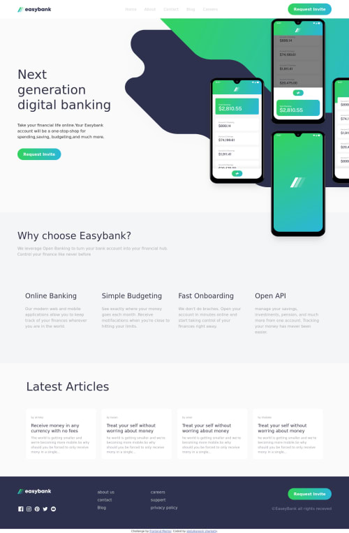
the landing pics are the hardest
Code
Please log in to post a comment
Log in with GitHubCommunity feedback
- @UserAhmad2001
Salaam alaikum
Hello Abdulkareem
You are right, I struggled quite a bit myself at that part.
If you want an easier way to achieve a responsive result, You should use a
transform: translate() ;css property to style the phones image, It Works like magic:.home-section-images{ flex-basis: 50%; width: 100%; position: relative; } .home-section-images .phones-img{ width: 100%; position: relative; left: 100%; transform: translate(-83%,-15%); z-index: -1; } .home-section-images .phones-bg{ width: 400%; position: absolute; left: 100%; transform: translate(-25%,-25%); z-index: -10; }Assuming that you used a flex display to align the home section texts and images
Hope i was of help to you, Tell me if you have any questions.
Happy Coding, And Best Regards
Ahmad

Join our Discord community
Join thousands of Frontend Mentor community members taking the challenges, sharing resources, helping each other, and chatting about all things front-end!
Join our Discord