


@pikapikamart
Posted
Hey, great work on this one. Layout in desktop is bit smaller and not centered right now but it's fine I guess. It is responsive though the mobile layout could make the buttons to occupy more width since right now, they are small.
Also, I didn't get the bug like what you said with using 2 clicks, everything seems working fine, but there is an error in the console, you might want to fix that since if you open up dev tools, then refresh the page, you won't get it to reload since the debugger will fire because of the bug.
Some other suggestions on the site would be:
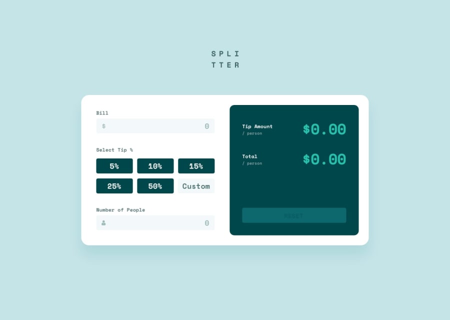
- Do not directly type the wordings as uppercase on the markup, if you do this, screen-reader will read the text letter-by-letter and not by the wordings. Use only the lowercase version to write in the markup and instead use
text-transform: uppercaseon it. - Also you don't need
bron theh1tag, you just need to first use aword-break: break-allproperty on it, then usemargin: 0 autoto center it and finally use amax-widthon it, adjust until you get the desired look. But remember to remove thebr. - Each text above the
inputshould be thelabelfor theinputitself and not a heading tag. - Those decorative images on the site could have use an extra
aria-hidden="true"attribute so that they will be totally hidden alongside with thealt="" - Also on the
inputdon't add a defaultvalueattribute, those are supposedplaceholdersand notvalue. By usingvalueusers will be confused on why there is already a value added. - Since you are using
buttonon this, it would be really great to add aaria-liveelement that will announce a certainbuttonhas been selected. Sincebuttonitself is not informative enough you will need this to further inform a user the selection. You might want to search foraria-liveif you were to implement this. - Make the visual indicator for the
buttonmore visible. Right now, usingtabkey on those, it is hard to tell where I am at right now so better tweaking the:focus-visiblestate of thebutton. - The custom-input needs to have an associated screen-reader
labelto it or anaria-label. The value for whatever method you pick will describe what does theinputneeds. - Adding a
cursor: pointerto the desktop version for eachbuttonjust to make it more natural. - Try to limit the output value for decimal place so that the text won't overlap the container if the result value has many decimal digits.
- Lastly, another idea is to have a
aria-liveelement that announces the calculator has reset if the reset-button has been pressed.
Aside from those, great job on this again.
Marked as helpful
@CoderPr0
Posted
@pikamart Thx allot for all the tips, it's of great help. I will look into all of this and make fixes.
