
Solution retrospective
The actual calculator logic could be greatly improved. I've refrained from dealing with large numbers overflowing the display due to the large font size. I'd like to return to this at a later time and make it better, if I can.
Please log in to post a comment
Log in with GitHubCommunity feedback
- @shweta-dabhole
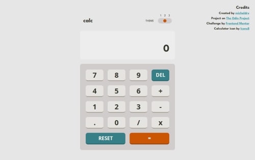
The calculator app is well-designed, responsive, and closely matches the intended layout. It effectively uses semantic HTML, but accessibility could be improved by adding
aria-labelsand ensuring better color contrast. The code is structured well, though modularizing CSS and JavaScript would enhance maintainability. Overall, it's a strong implementation with minor refinements needed for accessibility and reusability!

Join our Discord community
Join thousands of Frontend Mentor community members taking the challenges, sharing resources, helping each other, and chatting about all things front-end!
Join our Discord