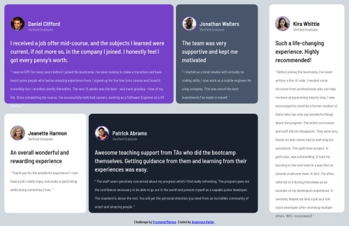
CardFlexForPost

Solution retrospective
little difficulty and verbose code CSS for me, more praticing in flex content
Please log in to post a comment
Log in with GitHubCommunity feedback
- @michagodfrey
Oh and well done keeping the accessibility issues to just one. I see that one is about no <h1> element. But there is no clear place to put a <h1>, is there. A cool trick to get rid of that is:
h1 { font-size: 0px; }
This style will make it invisible to users, but screen readers will still see it and you won't get the pesky issue on your frontend mentor challenges.
Hope that's helpful. Good luck on your future challenges!
Marked as helpful - @michagodfrey
Hi Anderson,
A solid effort here. Well done. Imo, yours actually looks better than than the design due to the shadows and slightly larger text makes it more readable.
Feedback: The desktop design is good, but it's not mobile responsive. I don't think your css is verbose, but I can see why this challenge would be tricky to do with flexbox. A simpler way might be to use flexbox for the mobile display and grid and grid-template-columns at desktop size with media-queries.
Below is a link to my solution, it's definitely not the best example of this challenge, but it shows what I mean:
https://www.frontendmentor.io/solutions/testimonials-grid-T_Nxd_c5z
Marked as helpful
Join our Discord community
Join thousands of Frontend Mentor community members taking the challenges, sharing resources, helping each other, and chatting about all things front-end!
Join our Discord