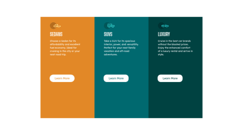
Cars4Us built with Tailwindcss

Solution retrospective
I submitted this solution still unsure how to do a few things.
- I wanted to anchor the 'Learn More' button to the bottom of the colored div, so as the page height changed the button remained a constant distance from the bottom of the div. I achieved this by setting a fixed margin-top css style to the button, but feel like there could be a better way of doing this - preferably within tailwind
- I attempted use a flexbox within a flexbox, but noticed that setting 'justify-between' on the inner flex box did not spread the items apart, though the same property successfully spread elements when set on the parent flex box container. I couldn't understand this behaviour. I had the three colored divs contained in a flexbox div, and tried to use each colored div as a flex box for its contents
- When making the screen more narrow, there are a few sizes where the 'Learn More' button is not lined up horizontally across all three colored divs as the paragraph text have different numbers of lines. Is using a flexbox the best way to resolve this type of problem (see qn 2) or are there other best practices?
- When I make the screen shorter (reduce the height) I want the colored div to reduce in size as well, until a minimum threshold then it should stop shrinking and force the user to scroll up and down. I acheived this by setting a % height and a minimum height in rem. I thought the % height was fine, but worry that setting the minimum height in rem may have consequences I didn't predict. Is there a best practice around this? 4.1 I also noticed that the white space from my top and bottom padding is no longer visible when I use this minimum height approach and reduce the vertical height of the screen. This is ok in my opinion, but I am curious as to how to keep the white space there while still setting the min-height to get scrolling once the screen is shrunk to a certain point
Please log in to post a comment
Log in with GitHubCommunity feedback
- @Risclover
Hi Alexander!
I happened to notice that a lot of what you're having trouble with, I did, too, but I found solutions that worked for me. I submitted my own version of this challenge just a couple of hours ago if you'd like to take a look. It was created via pure HTML and CSS. I've never used anything but vanilla CSS (so no Tailwinds knowledge), but I think that when looking through your code, I can tell (for the most part) what's what.
I'm replying to your solution questions because I feel like you and I have the same thinking in terms of how to execute this solution.
- You might want to consider putting another media query breakpoint from around 795px to at least 500px. I had to do the same because I had the same issue - the mobile layout was too stretched for that screen resolution. I ended up just putting in a stationary mobile layout (meaning no responsiveness) for a portion of the "middle" chunk of resolution sizes (check out my solution to see what I mean). I don't have nearly enough experience to know whether this is the "right" thing to do, but it works for this challenge I think.
- I, too, had decided that it would be best to do one big main container that the three smaller containers would fit into in order to use Flexbox to align everything correctly. I essentially achieved my mobile layout by making my big container
flex-direction: column, and I did the same with the 3 smaller containers (since everything is vertically placed,flex-direction: column;). Then for my desktop layout, my main container went to row while each individual container stayed column. My point in saying all of this is that that approach isn't the problem, which brings me to the next thing. - When you mention
justify-between, do you meanjustify-content: space-between? Or were you usingjustify-between? Because I don't think that exists, which is why it wasn't working. (Or wait, isjustify-betweena Tailwinds thing?) When thinking about my approach for tackling this challenge, I, too, had the initial thought of usingjustify-content: space-betweenfor the three smaller containers, but then I ended up using a combination of padding and margin to achieve good spacing. - In regards to your button/height problems, I have a solution for your buttons, but I wanted to say this first. With layouts like these, I tend to not touch height at all (in terms of responsiveness, I mean). I base my layout changes on width because when I try to change via height size, the results never seem to make sense, and I can't get it to look good. Personally, I don't think it's worth the huge space between the paragraphs and buttons in your 3 containers just so it's responsive to height change, but I also respect your opinion. :)
- As for your question about the button being misaligned in places, you actually helped me out! I thought I was all good in that regard and went back to see what I did, but then I noticed that my buttons were doing the same thing! So thanks for that! I had to dig through answers around the internet to find something that worked for my specific situation, but after a little while, I did find a solution, and I think it could work for you, too.
- Your 3 containers (the parent containers of the buttons) need to have
position: relative;set if they don't already. If you don't do this, the buttons will place themselves according to the actual page, not their boxes. - Give your buttons
position: absolute;. This is what will keep them still. - You also need to give your buttons
bottom: #px;, which places your buttons however many pixels above the bottom of each of the containers you want them to be.
(Edit: Oh duh, you're using Tailwinds... well, whatever the equivalent code in Tailwinds is, do that.)
As a side note, when I executed the above, all of my containers became too short, so I did have to adjust code elsewhere. I ended up needing to fiddle with my
<p>padding. But I fixed everything, and now my buttons stay aligned, so hopefully it works for you, too!Oh, and I don't know if you've seen this, but I just noticed that right before your page changes from desktop mode to mobile mode, the buttons get disproportionately tall and look wonky. Might want to look into that.
Alright, that's enough from me. I hope at least one little thing from this was helpful in some way. I'm pretty new to this too, so I'm not claiming that any of what I'm saying is best practice. I just wanted to share what worked for me.
Apart from the issues, your page looks wonderful! Keep it up.
Cheers!
Sara

Join our Discord community
Join thousands of Frontend Mentor community members taking the challenges, sharing resources, helping each other, and chatting about all things front-end!
Join our Discord