chat app css illustration using flexbox

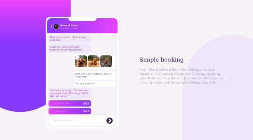
Solution retrospective
After 4 days of struggle, I finally got the closest UI output Earlier I used px unit for elements, which then I replaced with rem to make them responsive. Although I have used px for border-radius.
I would like some help for below points:
-
As per the desktop screen design provided in the challenge, my UI is displaying the mobile element bigger in size.
-
While setting the right bottom background div in mobile mode, first I used below css on element ".bgBottomRight", which was not setting the div properly position:absolute; bottom:0; right:0; After some research, I changed it to below code,which worked, but I couldn't understand the behaviour position:absolute top:100% right:0%
-
Is it a good practice to use margin and padding with flexbox to achieve the responsive. I think, with margin and padding my code is not looking clean
Please log in to post a comment
Log in with GitHubCommunity feedback
No feedback yet. Be the first to give feedback on Priyanka's solution.
Join our Discord community
Join thousands of Frontend Mentor community members taking the challenges, sharing resources, helping each other, and chatting about all things front-end!
Join our Discord