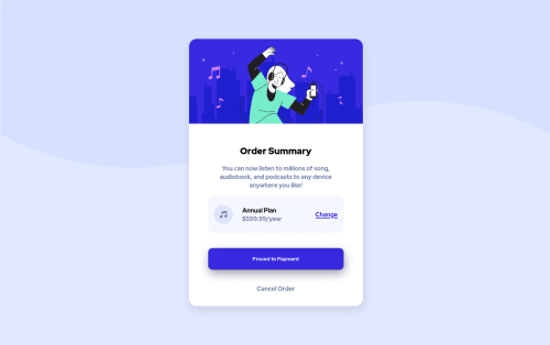
Checkout page of a music application

Solution retrospective
Can you please suggest some method or changes in my code to make it optimized. This code is very bad and unorganised. Can you suggest some method to make it more organised.
Please log in to post a comment
Log in with GitHubCommunity feedback
- @dmitrymitenkoff
Well done, Ranjan. The component looks really great.
I think your code base is well structured, and it was easy for me to follow the logic. To make it a little bit more succinct, you could try using CSS custom properties.
One thing I'd suggest is not skipping heading levels in your HTML. For example, I'd use
<h1>for the Order Summary and<h2>for the Annual plan. More information is here and here.Also, in mobile view, there's a little bit of white space at the bottom of the viewport visible. I'd suggest uncommenting the height property on the body element in your CSS - this should rid of the white gap at the bottom.
Other than these two minor things, great job and happy coding :)
Cheers
Marked as helpful

Join our Discord community
Join thousands of Frontend Mentor community members taking the challenges, sharing resources, helping each other, and chatting about all things front-end!
Join our Discord