Clipboard Landing Page

Solution retrospective
# Clipboard landing page
## Project description
Put your layout skills to the test with this HTML & CSS landing page challenge. This challenge includes a design for hover states.
## HTML landmarks
- header
- main
- footer
## DRY CSS code
I tried to apply DRY (Don't Repeat Yourself) as much as possible. I think with time and experience, I'll learn more about the best way to organize things (including DRY) just by looking at the layout or checking a design file if there’s one. There are still some ways to combine existing code in different media queries using clamp to make the responsiveness super smooth. I’ll tweak it over time.
## Keeping image aspect ratio
Because I explicitly set the width and height (based on the design), object-fit: contain; keeps the aspect ratio on smaller screens.
.features img {
  width: 19.5rem; /* 312px */
  height: 14.875rem; /* 238px */
  object-fit: contain;
  margin-block-end: 3.5rem;
}
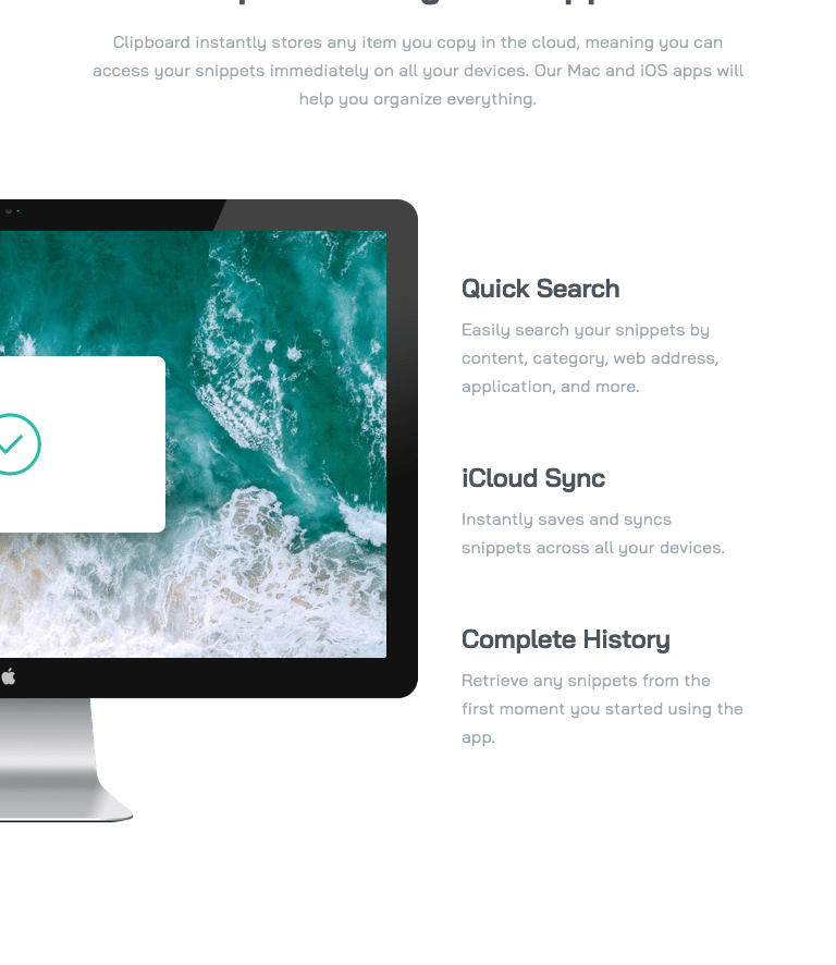
## box-shadow and screen shrink
When the screen shrinks, you might notice this problem: the image shrinks (because of responsiveness) and shifts out of its axis, creating a shadow border.
This happens because I added explicit dimensions to the image (to match the design).
To fix this, I wrapped the image in a box (div) and added the box-shadow to that box, so the box-shadow "follows" the image as it shrinks. Check it out:
.access .box-shadow {
  max-width: 19.4375rem; /* 311px */
  max-height: 11.375rem; /* 182px */
  position: relative;
  overflow: hidden;
  box-shadow: 0px 40px 50px 0px rgba(0, 0, 0, 0.07);
}

.access img {
  width: 100%;
  height: 100%;
  object-fit: contain;
}
Make sure to add max-width and max-height to keep it responsive. Now it looks good.
Is there another clever way to solver this? leave a comment please.
## This is not a simple hover
I think this is one of the big challenges of this project (mentioned in the project description). If you wander how to I did that hover on the buttons, the NTF Preview Card Component has the same hover effect. In this project, you’ll need to work with pseudo-elements and create a new color in front of the cyan color.
.btn-green {
  position: relative;
}

.btn-green:hover::after,
.btn-green:focus::after {
  content: "";
  position: absolute;
  top: 0;
  left: 0;
  right: 0;
  bottom: 0;
  border-radius: 100px;
  background-color: hsla(0, 0%, 100%, 0.25);
  z-index: 1;
}
If you want to add a transition, it gets a bit tricky since you set the background color’s opacity, so you can’t just use opacity: 1; directly on the pseudo-element. Here’s how it should look:
.btn-green::after {
  content: "";
  position: absolute;
  background-color: hsla(0, 0%, 100%, 0.25);
  top: 0;
  left: 0;
  right: 0;
  bottom: 0;
  border-radius: 100px;
  z-index: 1;
  opacity: 0;
  transition: opacity 0.3s ease;
}

.btn-green:hover::after,
.btn-green:focus::after {
  opacity: 1;
}
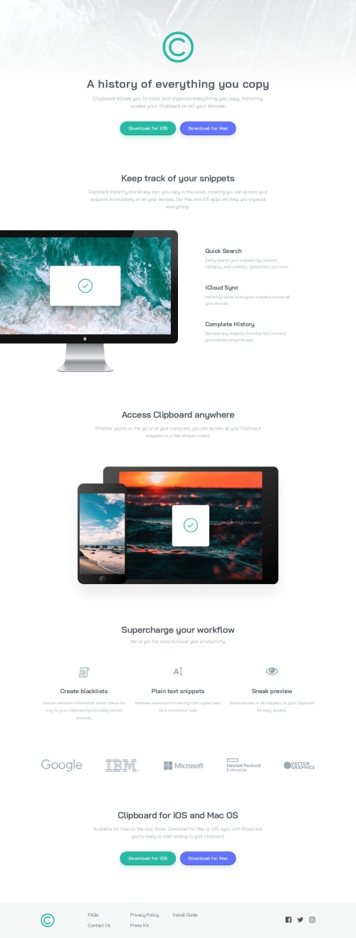
## My decision about responsiveness on the decorative computer image
About the section with the computer image on one side and the text on the other, I decided to keep the computer stuck to the left edge of the screen on all screen sizes from 768px up. The computer image maintains its aspect-ratio and takes up half the screen because I set that in the grid.
.features__image-and-features {
  display: grid;
  grid-template-columns: 50% 1fr;
  grid-template-rows: auto;
}
Another option could’ve been to keep the image at its original size on all screens from 768px, but the image content would stick out more than half off the screen.
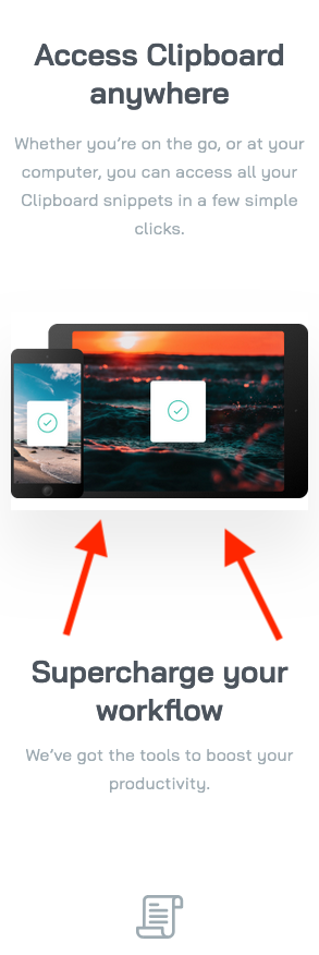
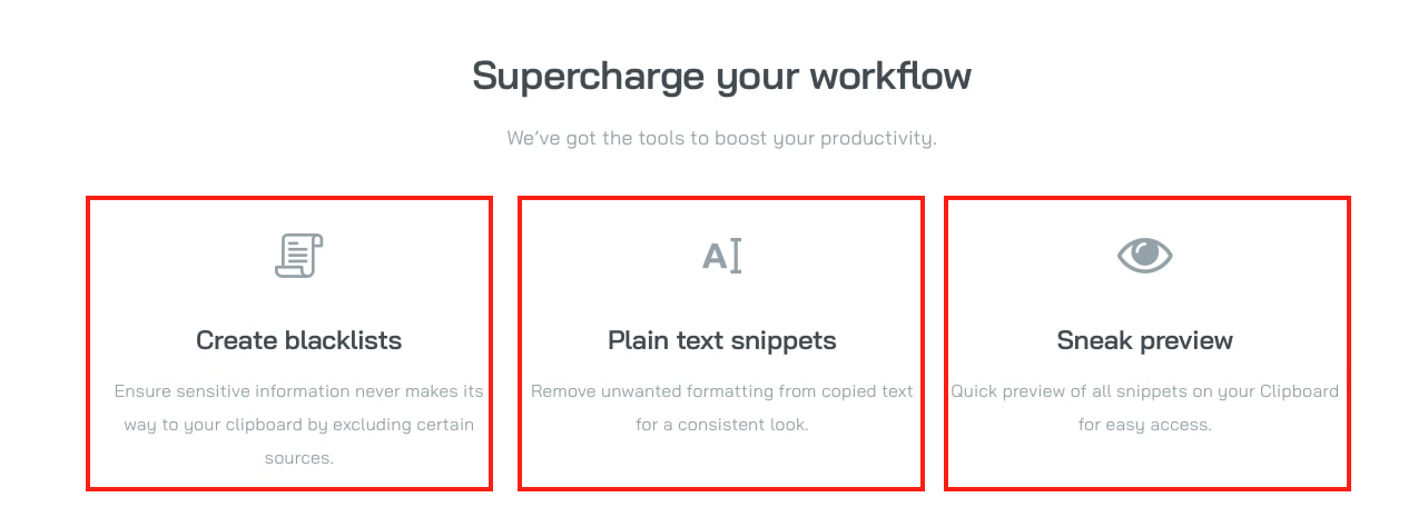
## The workflow list
Check the project image and you’ll see that it’s necessary to define space between each list item, center them, and when the screen is small, you’ll need to decrease the size of each list item.
I used flex: 1; to give equal space to each item. This is something I did in this project 3 column preview card component.
.workflow__list li {
  flex: 1;
}
## The partners/customers list
Sometimes we prefer some images to shrink, like in my decision about the access section image. In this case, I chose not to reduce the size of the partner/customer images. Since they’re in a list, I used flex-shrink: 0; to prevent these images from shrinking. When the screen size decreases, I opted to gradually reduce the gap between the images, and I think it looks nice. When there’s no more space as the screen shrinks, flex-flow: wrap; helps to break the line. What do you think?
.customer-logos__list {
  flex-flow: wrap;
  gap: clamp(2.5rem, -11.3675rem + 21.668vw, 5.9669rem);
}

.customer-logos__list li {
    flex-shrink: 0;
}
Something similar happens with the footer links. Check those out too!
What specific areas of your project would you like help with?These are some comments about my experience with this project. Feel free to comment on anything.
Please log in to post a comment
Log in with GitHubCommunity feedback
No feedback yet. Be the first to give feedback on Flávio César's solution.
Join our Discord community
Join thousands of Frontend Mentor community members taking the challenges, sharing resources, helping each other, and chatting about all things front-end!
Join our Discord