


Hi,
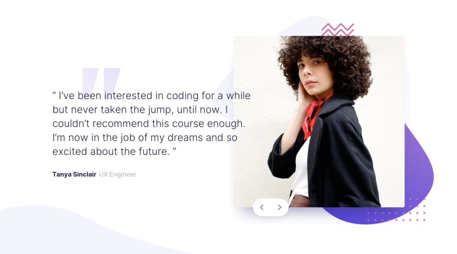
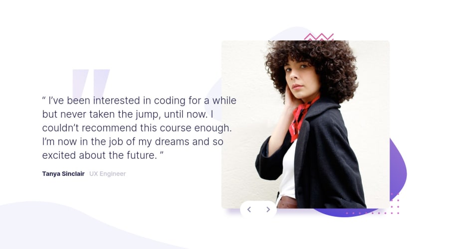
I think you need a little padding on the testimonial wrapper so content can't hit the sides of the screen, and I think your mobile styles kick in a bit suddenly / everything's a bit small on mid-sized screens. Maybe another media query in there, or just using max-width on elements would prevent loads of white space and tiny content in the center of the screen on those tablet screens...
With the animation I'm not sure what's happening exactly... It's something to do with using keyframes and the display property. Display can't be transitioned, so you might find it better if you used other properties like height, width, visibility, positions etc instead of display for these elements.
Good luck :)
@RenszCamacho
Posted
Hi, @grace-snow. It's true, it's not responsive at all. Either there are a lot of white spaces or there aren't any. I think I remember you told me in my last challenge, but I didn't quite understand the max-width thing. I'm going to work on it. Once again, Thank you so much! I learn a lot from your advice.
Have a nice one 😊
@RenszCamacho yeah it takes a while to understand how useful max width can be instead of width... If you start from mobile it makes more sense. Like, I know on mobile screens I want this to be full width. It's a block element. That's good, so it will be full width anyway. Let's resize the browser a little wider - still looks good. Let's go wider again - whoa, it's too big now! I know, I'll give it a max width ☺
@RenszCamacho
Posted
Thanks, @grace-snow, I get the idea, let's see if I am able to implement that.
