Submitted about 4 years agoA solution to the 3-column preview card component challenge
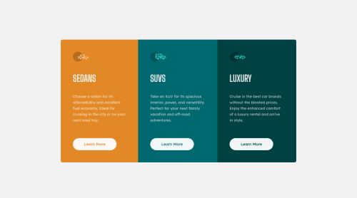
Column Card

@ezraakankwasa
Solution retrospective
Did I do it right? Also is the semantic HTML right?
Code
Please log in to post a comment
Log in with GitHubCommunity feedback
- @vanzasetia
👋 Hi Ezra Akankwasa! My name is Vanza!
I have a feedback on mobile view. I think you can remove these two properties from your
bodystyle:body { margin-left: 17%; margin-right: 17%; }Since it makes all the cards right align (try to see it with dev tool and set the screen size to 360px * 640px).
Also a feedback on your html, the best practice is always using only one
h1onheader, so my recommendation is that change allh1toh2.That's it! Hopefully this is helpful!
Happy Coding!
Marked as helpful - P@jmnyarega
You did great @ezraakankwasa 🙌 and the semantic HTML is looking great.
One Nitpick:
- When hovering on the buttons, the whole card seems to shift position, you can easily fix that by giving the border the same value before and after hovering. your case, I think this should work.
.btn { border: 0.15rem solid; // on hover is 0.15rem too. }Marked as helpful


Join our Discord community
Join thousands of Frontend Mentor community members taking the challenges, sharing resources, helping each other, and chatting about all things front-end!
Join our Discord