Column Preview, HTML/CSS

Solution retrospective
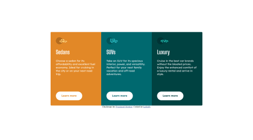
Had an issue with positioning the buttons to the bottom of the cards. Maybe using 'position: relative' to parent div and then 'position: absolute' to buttons but I was not sure whether the web would remain responsive or not. I tried to use 'display: flex' to parent div and then 'justify-content: bottom' to buttons but that just messed up whole design. Any advice is welcomed.
Please log in to post a comment
Log in with GitHubCommunity feedback
- @mpbrunelle
Hi kefiiiiR,
To answer your question about the alignment of the buttons:
If you add a
display: flexon each card, you could then add aflex-grow: 1on each.card-descriptionelement. By default, flex-grow is set to 0, which means that each element never takes more space than the minimum. If you set this property to 1 on .card-description and not on the other elements, .card-description take all the space available and push the other elements to the top and bottom.Hope this helps.
Marked as helpful - Account deleted
hi @kefiiiiR! congrats on finishing the challenge!
a couple suggestions:
- Document should have one main landmark, this should contain the main part of your challenge, you can fix it like this:
<div class="container"> <-- remove <main class="container"> --> add- All page content should be contained by landmarks, at the end of your code you have a div that can easily be a footer:
<div class="attribution">  <-- remove
<footer class="attribution">  --> add
I hope this feedback has been useful to you! keep coding :)
Marked as helpful

Join our Discord community
Join thousands of Frontend Mentor community members taking the challenges, sharing resources, helping each other, and chatting about all things front-end!
Join our Discord