


@pikapikamart
Posted
Hey, great work on this one. The layout in desktop is good as well in mobile state.
My two suggestions would be:
-
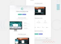
maybe at the first breakpoint, giving a fixed height or width, or just setting max on your image will be good. Because as I resize, the image is really huge. Because adjusting it will be awesome.
-
Also at the first breakpoint, I see that you changed the text-alignment, but consider using only one text-align, because we want to make it consistent right. Because setting some text in center, then above is left, there is no consistency on that. Just tweaking those will be great.
Regarding your query
I looked into your repo and it seems fine for me. I don't really use resources on how to use Sass, I just kind of picked them along and doing good practices, for me, but still have a long way to go.
Also no boiler plate for me, well just some css.
html {
  box-sizing: border-box;
  font-size: 100%;
}

body {
  margin: 0;
  padding: 0;
}

*,
*::before,
*::after {
  box-sizing: inherit;
}
Just some base. But when using scss, try making of use extension or mixins or some functions, that would be really awesome.
Lastly, we use @use to import our other components right, we use it to have "namespaces" on them because it makes sure there are no other component that have the same name on them. But you imported using "*" which now removes that namespace. So basically, you just remove that which I think is not ideal. Just use @use with importing them as a whole, still having the namespace.
Overall, really good work on this one^^
@KtGitIt
Posted
Thank you for your feedback. I have put your suggestions to work. First breaking point was cause by "flexible grid" but now is fixed by adding media query followed by centering the text and adding max-width to image. You have no idea how much you have helped me by providing these suggestion as well as your thoughts about Saas. Thanks once again!!
