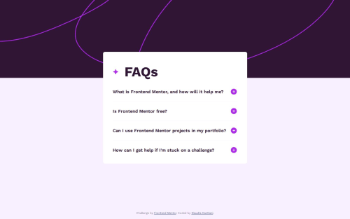
Submitted 20 days agoA solution to the FAQ accordion challenge
container at-rule for background image change

P
@cla91
Solution retrospective
What challenges did you encounter, and how did you overcome them?
The problem I encountered was that the rem unit in the media feature behaved differently from rem unit in other elements. To overcome the problem, because I wanted the breakpoint to be at 375px which is the size of the mobile background image, I used the container at-rule even if it's still pretty recent.
What specific areas of your project would you like help with?Where would you put the breakpoint for the background image?
Code
Please log in to post a comment
Log in with GitHubCommunity feedback
- @thisisharsh7
Excellent work on completing the challenge! 👏
👍 Strengths:
- Great use of
container-type: sizeand@containerfor the background breakpoint — future-facing and precise! - Clean, semantic HTML with meaningful structure using
<section>and<article>. - Your JavaScript handles state toggling accessibly with
aria-expandedandaltupdates — well done!
🔧 Suggestions:
- Background image breakpoint: Your use of
@container (width > 37.5rem)works well, but for broader support you could consider a fallback using@media (min-width: 600px)alongside the container query. - Accessibility: Consider adding
aria-controlson buttons to associate them directly with their answer<p>elements. - Performance: Preload or use
loading="lazy"for icons if reused in large UIs.
Overall, great work - happy coding!
- Great use of
- @UmairFaiser
Heh nice work.i think the animation needs to be more smooth but overall nice work.well done


Join our Discord community
Join thousands of Frontend Mentor community members taking the challenges, sharing resources, helping each other, and chatting about all things front-end!
Join our Discord