Submitted over 1 year agoA solution to the Blog preview card challenge
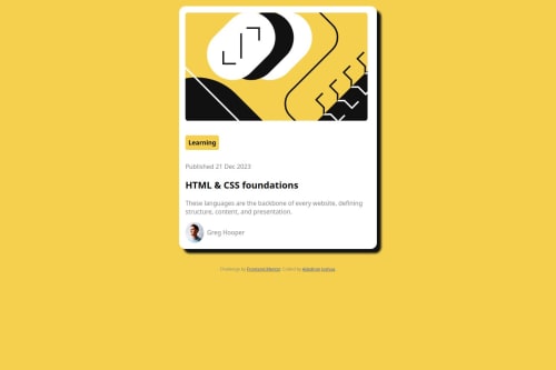
Created a responsive blog preview page with html and css

@Challmejosh
Code
Couldn’t fetch repository
Please log in to post a comment
Log in with GitHubCommunity feedback
- @Blackpachamame
Greetings! you have done a great job 😎
📌 Some suggestions
- The
justify-content: centerandalign-items: centerproperties in thebodydo not work if they do not have adisplay: flexordisplay: grid - Apply
max-width: 100%to yourimgso that it occupies the correct width within the container - This
grid-template-rows: repeat(2, auto)does nothing - You can replace the
widthofmainwith20reminstead of30rem - You can use the
gapproperty in thebodyto separate yourmainfrom yourfooter. Don't usebrfor this - Instead of using
marginto center your content in the center of the screen, you can use theflexboxproperties in thebody:
body { background: hsl(47, 88%, 63%); box-sizing: border-box; padding: 0; font-size: 16px; font-family: Arial, Helvetica, sans-serif; color: hsl(0, 0%, 50%); margin: 0; min-height: 100vh; display: flex; justify-content: center; align-items: center; flex-direction: column; gap: 20px; /* Separate the main from the footer */ }Marked as helpful - The

Join our Discord community
Join thousands of Frontend Mentor community members taking the challenges, sharing resources, helping each other, and chatting about all things front-end!
Join our Discord