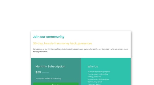
Created Cards using Bootstrap for responsiveness

Please log in to post a comment
Log in with GitHubCommunity feedback
- @pranshudobhal
@BeardedArtist I just checked your code and when I reduce the size of the window, it does seem a bit off and that is because of the padding. I removed the unnecessary padding and it looked good to me. Try to look into the padding of the "Monthly Subscription" and "Why us".
To be more precise, when you are downsizing the window to the mobile size, the bottom two cards are taking the padding of the desktop version and that is what is causing the shift in cards to the right and left.
Try removing all padding properties from "Monthly Subscription" and "Why us" cards. And then from .column-left, remove padding-right and from .column-right, remove padding-left. This will solve your mobile issue. Now in the desktop version media query, in .column-left, add padding-right:0; and in .column-right, add padding-left: 0;
Hope this helps!
- @pranshudobhal
Hey! I am not able to see your project on vercel. Can you try importing it again properly? Once you are done with this, let me know, will check the issue that you are encountering.
- @VictorSanchez25
Hi! Is it working if you opened your website through github? Try importing it again on vercel and see if it changes anything. Hoping for the best!


Join our Discord community
Join thousands of Frontend Mentor community members taking the challenges, sharing resources, helping each other, and chatting about all things front-end!
Join our Discord