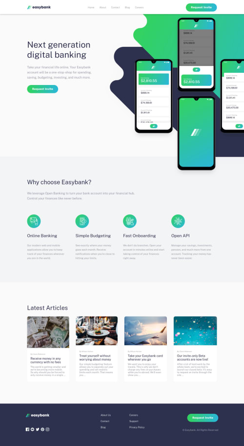
Submitted over 3 years agoA solution to the Digital bank landing page challenge
Created using HTML, SCSS and JS - Fully Responsive.
bem, sass/scss

@ohermans1
Solution retrospective
Feedback appreciated!
I didn't spend much time on the responsiveness, but I am happy enough with the end result. Looking forward to my next project, which will be my first attempt with React.
Code
Please log in to post a comment
Log in with GitHubCommunity feedback
- @SOURABH358
Good work overall @ohermans1, congrats on finishing the challenge.🎉 Some suggestions from my side: Use bigger font sizes for smaller screen sizes. On a smaller screen when you click on hamburger and then resize it back to desktop you can still see hamburger. You can use innerWidth or matchMedia to detect changing screen sizes Overall Website looks great.👍
Marked as helpful

Join our Discord community
Join thousands of Frontend Mentor community members taking the challenges, sharing resources, helping each other, and chatting about all things front-end!
Join our Discord