Not Found
Not Found
Not Found
Not Found
Not Found
Not Found
Not Found
Not Found
Not Found
Not Found
Not Found
Not Found
Not Found
Not Found
Not Found
Not Found
Not Found
Not Found
Not Found
Not Found

Submitted

Creative Single Page Site / CSS Grid, Mobile-first, Sass, Vanilla JS
Tereza 605

@sirriah

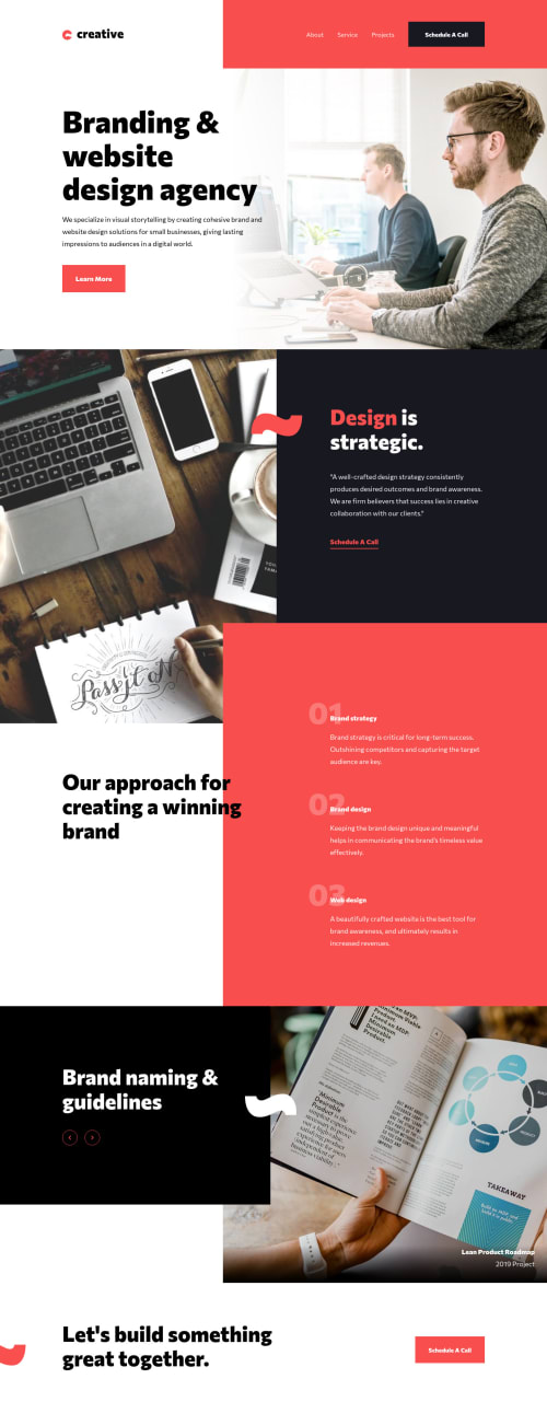
Desktop design screenshot for the Creative agency single-page site coding challenge

This is a solution for...

  • HTML
  • CSS
  • JS
3intermediate
View challenge

Design comparison


SolutionDesign

Solution retrospective


Hello! Well, this almost drove me crazy :D I spend few days thinking about the layout. I couldn't decide if I should use CSS Grid or Flexbox. First I try to use Flexbox, but when I finished mobile view I started again with Grid. Positioning was little bit tricky, but I made it. But then, I opened it in Chrome :D and everything was broken. I used properties like grid-template-columns: subgrid, padding-inline, padding-block, margin-inline etc. And this is not supported in some browsers - so I recreated it again. Please, look at my solution and tell me, what I should improve. I always have a problem with semantic html. Have a nice day and Happy coding! 👋👩‍🦰

Community feedback

P
ApplePieGiraffe 30,565

@ApplePieGiraffe

Posted

Hello, Tereza! 👋

Very good job on this challenge! 👍 Your attention to detail has been great and everything looks good and responds well! 👏 I really like the animation that you added to the slider! 🤩

The only super tiny thing that I noticed is a horizontal scroll bar appears along the bottom of the page in the desktop layout on my screen. Adding overflow-x: hidden to the body should fix that easily! 😉

Keep coding (and happy coding, too)! 😁

Marked as helpful

1
P
Grace 27,930

@grace-snow

Posted

This is great, we'll done!

I particularly like seeing how you are considering accessibility throughout this. I have some tips for you that I think will build on your existing understanding but want to do it justice after all the effort you've put in here. I'll set myself a reminder to send more feedback tomorrow as it's very late here ☺

And don't worry about changing approach multiple times. We all do that all the time, it's part of the challenge of frontend dev!

Really nice work

1

Tereza 605

@sirriah

Posted

@grace-snow thank you Grace, that would be great :)

0
P
Grace 27,930

@grace-snow

Posted

OK I've got a few minutes spare so will give you a list of things as I see them. Some are just suggestions, some opinions you can take or leave, some more important. But don't let any of it discourage you as like I said before, this is already excellent! 🎉

  • I would remove width 100vw from HTML and body. They are already 100% wide. By setting them to be 100vw you are causing overflow because viewport units don't accommodate for scrollbars. So your width becomes width of my viewport + width of my scroll bar
  • company logo is usually wrapped in a link to homepage. Not essential but it's an established convention you might want to follow
  • Because you've added <span class="sr-only">Menu</span> that text is being read out by my screenreader in all viewport sizes, even desktop. Instead, if you used an interactive element for your mobile nav toggle <div class="hamburger-menu mobile-only"> like an anchor tag or button, you could have an aria-label on it that gets read out by a screenreader only when the menu toggle is visible. You would also get the added benefit of keyboard interactivity for free with no extra effort 😁
  • More of a suggestion - there's no need to duplicate your menu in the HTML. Instead, why not just change the styling of the one menu between mobile and desktop. That used to be a benefit for SEO as it marked sites down for duplicate content, but I honestly don't think that is the case any more. There is a teeny performance boost from less HTML but it's negligible. This is more of a principle not to repeat yourself if you can help it.
  • What is it you would expect to happen on click of the schedule a call CTA? I'm not sure why you are using an anchor tag but changing its role to be button. Just use the appropriate element. If it triggers navigation, that's anchor tag, if it performs an action like submits a form or triggers some js, a button is probably right. Changing roles changes the controls for that element, so only ever do that for really good reasons.
  • If you want hero__image to be announced by screenreaders, that's actually a good use case to apply a role. You definitely shouldn't be adding spans with sr-only text that says image: .... This is because these will be read out as isolated bits of text with the screenreader focus appearing nowhere near the image. It would be better to add role="img" alt="description of my image here" to the hero__image div. This would make the image appear on the site's image menu for assistive technologies (screenreaders have a selection of menus users open to browse a site, like Headings / Links / Landmarks / Images...)
  • Same goes for pretty much every image on this challenge. If it's meaningful and you think it should be described, but it's a background image, change the role and add alt text. Otherwise, if it's less important and doesn't need describing, don't add any sr-only text just let it be a background image. At the moment, the image list on this challenge only lists the logo because of how this is done.
  • LOVE the way you've added the counter to details__list list items. That's all, just wanted to say nice work there 👏
  • Similar to the above with the carousel buttons - if you want to use buttons, use buttons in the HTML, no need to swap roles
  • I've gone on a lot about screenreaders in this feedback, but the most common piece of assistive technology used worldwide are keyboards. At the moment, as a keyboard user I cannot navigate around the page properly because there is a lack of visible focus states. Look into two properties :focus and :focus-visible and see how they could improve keyboard navigation on your site by applying to interactive elements.

Lots of info for you there. I hope it's helpful for you. The most important thing of all with building inclusive solutions is writing quality HTML structure and you have nailed that here on the whole. The rest is just knowledge and experience that builds over time.

If you want to try out screenreaders, they are included on all andoid and apple devices, and there are free ones like NVDA on windows machines.

Keep going and I look forward to seeing what you do next!

Marked as helpful

2
Tereza 605

@sirriah

Posted

@grace-snow Thank you very much. I am very grateful to you. I try to do my best and I will try to rebuild some parts :).

0
P

@MarkoNikolajevic

Posted

Hi Tereza, you did really an amazing job with this challenge.

Everything is responsive, all animations are great especially the slider's one and adding sr-only class for accessibility is a plus. :)

Your code is well documented and clean.

Congratulations for completed it especially after the struggles you had in the beginning! :)

Keep coding and have fun

1

Please log in to post a comment

Log in with GitHub
Discord logo

Join our Discord community

Join thousands of Frontend Mentor community members taking the challenges, sharing resources, helping each other, and chatting about all things front-end!

Join our Discord