Not Found
Not Found
Not Found
Not Found
Not Found
Not Found
Not Found
Not Found
Not Found
Not Found
Not Found
Not Found
Not Found
Not Found
Not Found
Not Found
Not Found
Not Found
Not Found
Not Found

Submitted

Crowdfund page

Marta• 630

@martam90

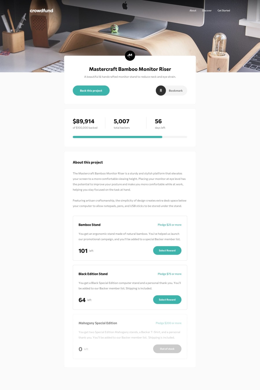
Desktop design screenshot for the Crowdfunding product page coding challenge

This is a solution for...

  • HTML
  • CSS
  • JS
2junior
View challenge

Design comparison


SolutionDesign

Community feedback

P
Grace• 27,950

@grace-snow

Posted

Hi Marta, the delay problem is caused by a transition delay of 300ms on all properties on your nav links. It's almost always better to explicitly state what properties you want to transition, like color 0.3s ease-in-out

This is the issue:

.nav__list-link {
  /* transition: ease-in-out 300ms; */ //equates to transition: ALL with a delay of 300ms
  transition: ease-in-out; // follow pattern of: property-to-transition transition-duration transition-timing-function transition-delay
}
3
P
Grace• 27,950

@grace-snow

Posted

With the modal, it's opening below the visible part of the page on some screensizes because of how you're positioning it. It should have a structure like this:

// body overflow hidden when modal is open
-- modal (container positioned absolutely filling whole page, overflow auto)
---- modal-background (dark opaque background filling whole page)
---- modal-inner (box with content in it positioned centrally on the page)

Here is some example markup:

// html
<div id="disclaimer" class="modal js-disclaimer" hidden>
      <div class="modal__background"></div>
      <article class="modal__content">
        <div class="flow modal__content-inner">
          {{ content }}
        </div>
      </article>
</div>

// css 
// NB: get-size() get-color() are my sass functions - they're just reading variables
body.no-scroll {
  overflow: hidden;
}

.modal,
.modal__background {
  position: fixed;
  top: 0;
  right: 0;
  bottom: 0;
  left: 0;
}

.modal {
  position: fixed;
  z-index: 40;
  visibility: hidden;
  display: flex;
  flex-direction: column;
  justify-content: center;
  align-items: center;
  padding: get-size('500');
  overflow: hidden;
  opacity: 0;
  transition: all 0.3s ease-in-out;

  &.is-active {
    visibility: visible;
    opacity: 1;
    transition: all 0.3s ease-in-out;
  }
}

.modal__background {
  background-color: rgba(10, 10, 10, 0.86);
}

.modal__content {
  position: relative;
  margin: 0 auto;
  width: 100%;
  max-height: 80vh;
  overflow: auto; // in case inner content needs to scroll
  background-color: get-color('body-bg');
  box-shadow: 0.35rem 0.5rem 1rem 0.15rem rgba(0, 0, 0, 0.3);

  @include apply-utility('measure', 'long'); // sets max-width to 65ch to stop text lines getting too long
}

.modal__content-inner {
  padding: get-size('600');
}
2

Marta• 630

@martam90

Posted

@grace-snow Thank you for detailed explanation! I really appreciate your feedback. :)

0

Please log in to post a comment

Log in with GitHub
Discord logo

Join our Discord community

Join thousands of Frontend Mentor community members taking the challenges, sharing resources, helping each other, and chatting about all things front-end!

Join our Discord