Please log in to post a comment
Log in with GitHubCommunity feedback
- P@kalihari90
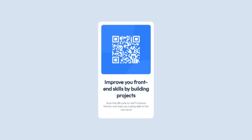
Hello. Overall solution is good, but not perfect yet. You forgot to change font-size of the title to the 22px which makes your card component too high. The paragraph below is perfect. Padding seems to be ok everywhere. Try add some box-shadow to the .card, on the bottom especially. Code is readable and well-structured, but if the project will be bigger than this one it would be good practise to use more detailed class names. Good work and keep it going.
Join our Discord community
Join thousands of Frontend Mentor community members taking the challenges, sharing resources, helping each other, and chatting about all things front-end!
Join our Discord