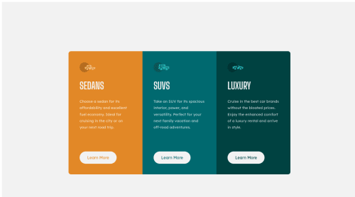
Skip to content
  • Unlock Pro
  • Log in with GitHub
Solution
Submitted over 3 years ago

CSS and HTML

Ali Rıza Darcan•10
@alidarcan
A solution to the 3-column preview card component challenge
View live sitePreview (opens in new tab)View codeCode (opens in new tab)

Solution retrospective


This is my first attempt in here. I am newbie. How can I add desktop and mobile seperately? Could you check my code, too? I

Code
Select a file

Please log in to post a comment

Log in with GitHub

Community feedback

  • Bradley Smith•230
    @bradleyhop
    Posted over 3 years ago

    You're project matches the desktop design very well. Good job!

    I took a look at your code, and it looks like you only use on class per element, which leads to redundancy in your CSS. That, in turn, can make it harder to maintain your code as the projects become more complex. Let's take your cards, for example. In your html, you could do something like:

    <div class="card suvs">
      <p>Example content.</p>
    </div>
    <div class="card sedans">
      <p>More example content.</p>
    </div>
    

    And then in your CSS:

    .card {
      height: 410px;
      width: 210px;
      padding: 45px;
    }
    .suvs {
      background-color: hsl(184, 100%, 22%);
    }
    .sedans {
      background-color: hsl(31, 77%, 52%);
    }
    /* etc */
    

    This way, you can set a base size for your card with one class and have another class that will specify specific attributes to that card. All the styling from multiple classes will be applied to element its assigned to.

    As far as making the site device-responsive, look into media queries and maybe start with CSS Flexbox to help you flow the cards into a column or row. A hot tip I picked up the other day: build the site with the styles being for mobile as the default, and then make changes as needed in your media queries (this is mobile first development and can really help you build your project).

    I've been learning lots from Kevin Powell's youtube channel for great tutorials and tips on CSS and other aspects of frontend web development: https://www.youtube.com/kepowob

    Happy coding!

    Marked as helpful
  • Shashree Samuel•8,860
    @shashreesamuel
    Posted over 3 years ago

    Hey good job completing this challenge

    Keep up the good work

    Your solution looks great however I think that the button needs less padding on the top and bottom using the respective properties.

    In terms of accessibility issues simply wrap all your content between main tags

    I hope this helps

    Cheers

    Happy coding 👍

  • Kamasah-Dickson•5,570
    @Kamasah-Dickson
    Posted over 3 years ago

    So learn about CSS responsive design which you will learn somethings like CSS flexbox CSS Grid And Media Queries

    Happy coding 👍

Join our Discord community

Join thousands of Frontend Mentor community members taking the challenges, sharing resources, helping each other, and chatting about all things front-end!

Join our Discord
Frontend Mentor logo

Stay up to datewith new challenges, featured solutions, selected articles, and our latest news

Frontend Mentor

  • Unlock Pro
  • Contact us
  • FAQs
  • Become a partner

Explore

  • Learning paths
  • Challenges
  • Solutions
  • Articles

Community

  • Discord
  • Guidelines

For companies

  • Hire developers
  • Train developers
© Frontend Mentor 2019 - 2025
  • Terms
  • Cookie Policy
  • Privacy Policy
  • License

Oops! 😬

You need to be logged in before you can do that.

Log in with GitHub

Oops! 😬

You need to be logged in before you can do that.

Log in with GitHub

How does the accessibility report work?

When a solution is submitted, we use axe-core to run an automated audit of your code.

This picks out common accessibility issues like not using semantic HTML and not having proper heading hierarchies, among others.

This automated audit is fairly surface level, so we encourage to you review the project and code in more detail with accessibility best practices in mind.

How does the CSS report work?

When a solution is submitted, we use stylelint to run an automated check on the CSS code.

We've added some of our own linting rules based on recommended best practices. These rules are prefixed with frontend-mentor/ which you'll see at the top of each issue in the report.

The report will audit all CSS, SCSS and Less files in your repository.

How does the HTML validation report work?

When a solution is submitted, we use html-validate to run an automated check on the HTML code.

The report picks out common HTML issues such as not using headings within section elements and incorrect nesting of elements, among others.

Note that the report can pick up “invalid” attributes, which some frameworks automatically add to the HTML. These attributes are crucial for how the frameworks function, although they’re technically not valid HTML. As such, some projects can show up with many HTML validation errors, which are benign and are a necessary part of the framework.

How does the JavaScript validation report work?

When a solution is submitted, we use eslint to run an automated check on the JavaScript code.

The report picks out common JavaScript issues such as not using semicolons and using var instead of let or const, among others.

The report will audit all JS and JSX files in your repository. We currently do not support Typescript or other frontend frameworks.

Oops! 😬

You need to be logged in before you can do that.

Log in with GitHub

Oops! 😬

You need to be logged in before you can do that.

Log in with GitHub

Oops! 😬

You need to be logged in before you can do that.

Log in with GitHub