css and html

Solution retrospective
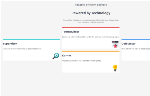
i was not sure how to do this kind of design which looks like a cross, i used a tool to find the right grid layout and it was it .
What specific areas of your project would you like help with?i'm not sure that my mobile version is good , any suggestions or critics are welcome
Please log in to post a comment
Log in with GitHubCommunity feedback
- @nadielotiene
Hello Langlois, most of the design looks good and the code looks clean and organized but there are some issues:
-
Make sure you use the right tags for sections like the header, main, sidebar, footer, etc. for accessibility and screen readers. Make sure you check the markdown report on the code preview page, and read the articles on the issues, they are very helpful.
-
The text on the header is missing the right font even though is in the main section. The "Reliable, efficient delivery" font needs to be thinner. The header is also missing padding on the sides.
-
You need to add some padding on the cards, the contents are too close to the edges.
-
You need to eliminate the viewport width vw on the containers to avoid side scrolling, use percents % IF you have to.
-
On the desktop layout you need to use max-width to control how wide you want the cards to be.
I can't recommend enough Kevin Powell's Conquering Responsive Layouts, It has helped me so much, and I understand everything so much better.
Congrats on completing the challenge, have a good day and keep on coding!
-
Join our Discord community
Join thousands of Frontend Mentor community members taking the challenges, sharing resources, helping each other, and chatting about all things front-end!
Join our Discord