Solution retrospective
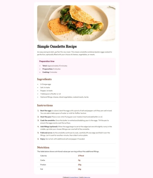
I couldn't get the background-color for desktop sizes and also the image, the border-radius property didn't work well with it
Please log in to post a comment
Log in with GitHubCommunity feedback
- @5nufkin
Hi there, Good job on this one, your website seems responsive and looks good! One thing I noticed right away was the body background color that's not exactly what you were asked to do, consider fixing this. About your html file - for better readability and structure, consider adding a header and a footer - in the header you could include the image and name of the recipe, then in main the recipe itself and in the footer you could put your note - "challenge by frontend mentor..." Also, consider naming classes in a more meaningful name that would help understand your code, c1, c2 and so on doesn't really deliver the message on what exactly this class is about. In addidtion, consider using sections and ids as well, ids are used for elements that you only have one of in your code, for example you could replace the
c2div with asectiontag, it would look like this:<section id="preparation-time">....</section/That would make your code much more readable. Your CSS looks good and it looks like you took a mobile-first approach which is a great way to design these days, very good! I hope this was helpful, keep going - you're on the right track!
Join our Discord community
Join thousands of Frontend Mentor community members taking the challenges, sharing resources, helping each other, and chatting about all things front-end!
Join our Discord