Not Found
Not Found
Not Found
Not Found
Not Found
Not Found
Not Found
Not Found
Not Found
Not Found
Not Found
Not Found
Not Found
Not Found
Not Found
Not Found
Not Found
Not Found
Not Found
Not Found

Submitted

CSS Flexbox

Montse Ag 35

@kiutkat

Desktop design screenshot for the Profile card component coding challenge

This is a solution for...

  • HTML
  • CSS
1newbie
View challenge

Design comparison


SolutionDesign

Solution retrospective


I struggled with the circles in the background, at the end I chose them to be background images but I think another proper solution would have been to put them in the body of the html and style them with position, however I couldn't achieve what I wanted because the circles overlapped onto the card and also they messed up the responsiveness. Any ideas? Thank!

Community feedback

P
Grace 27,890

@grace-snow

Posted

Hi Montse,

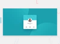
This looks OK on mobile portrait, you just need some margin around the card or padding on the container so it's not hitting the sides of the screen.

The layout breaks on mobile landscape atm, I think because of a flex row making the footer move to the side, so maybe have a look at that.

I do see some real issues with your html at the moment, so that's where I'd advise you focus your learning next:

  • sections are really important semantic html tags. This whole card might be a section, but definitely not the parts within it, and definitely not nested as you have it now. Think of sections as something that would deserve to be listed on a contents page of a big document or book, that's where you use them.
  • almost all content is in headings at the moment. Again, think about the meaning of the content here. The name could be a heading for the whole card, but what is the country a heading to? That should probably just be a paragraph tag.
  • similarly, what would a heading of "803k" mean? The numbers don't make sense as headings and need to be read with the word that comes after them. That means placing both in one meaningful tag, like a paragraph or list item, and using classes on spans within that tag to style the two parts differently.
  • Last thing is alt text. It needs to be readable as words and a meaningful description. So the name would be fine, but you never need to include words like 'image' or 'photo' of because that is already announced by the presence of the image tag itself.

I hope this makes sense and is helpful. Keep going! ☺

2

Montse Ag 35

@kiutkat

Posted

Wow, first of all, thank you Grace for taking the time to evaluate my solution and thanks so much ofr the feedback, I really learned a lot from this comment. !

0

@adluders

Posted

I honestly think putting them as background was a good idea. My only suggestion would be to not flex the body itself, perhaps flex the main tag that you have on there. I feel like that might be a personal preference but other than that, I think you did really well. It felt responsive on my computer when I resize it so I think you did well.

2

Montse Ag 35

@kiutkat

Posted

@adluders Thanks a lot, it's nice to know how other people code <3 I will definitely think next time about putting the body as a flex container.

1
P
ApplePieGiraffe 30,545

@ApplePieGiraffe

Posted

Hi, Montse Ag! 👋

Nice job on this challenge! 👏

I also think it's a good idea to add the circle SVGs to this challenge as CSS background images because that'll make your markup cleaner and I think it's a little easier to position the images, then, without them getting in the way of other things on your page. Using viewport units to position the background images (as you've done) also works great, as it keeps the circles in their place when the size of the screen changes. 😉

Keep coding (and happy coding, too)! 😁

0

Please log in to post a comment

Log in with GitHub
Discord logo

Join our Discord community

Join thousands of Frontend Mentor community members taking the challenges, sharing resources, helping each other, and chatting about all things front-end!

Join our Discord