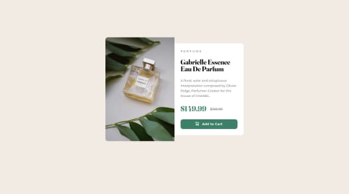
Not Found
Request path contains unescaped characters
Not Found
Not Found
Not Found
Not Found
Not Found
Not Found
Not Found
Not Found
Not Found
Not Found
Not Found
Not Found
Not Found
Not Found
Not Found
Not Found
Not Found
Not Found

Submitted

Product Preview Card Challenge

#accessibility
Kachi 20

@IAmKachi

Desktop design screenshot for the Product preview card component coding challenge

This is a solution for...

  • HTML
  • CSS
1newbie
View challenge

Design comparison


SolutionDesign

Solution retrospective


Hey Guys, I just completed the product preview card project. I'm a newbie and my code is filled with errors and bad practices. I'll love criticisms and reviews on the code and how I can improve in the future. My questions for this challenge are:

  1. I found media queries difficult to understand. two images were provided for the desktop and mobile designs respectively. I didn't know how to change the image responsively based on the screen size. I'll need all the help I can get on this. Thanks.
  2. I'll love to know more on how to handle events with JavaScript.

Community feedback

@rockingrohit9639

Posted

Hey @IAmKachi

Media queries are difficult at first but when you get to know about they become a lot easier. You can refer to this link to learn about media queries -> Media Queries

Firstly learn about these two media queries and more than half of the work will be done -

 @media only screen and (min-width: 900px) {}
 @media only screen and (max-width: 900px) {}
  • You should use semantic HTML tags, they define the meaning to both the developers and browsers. Some tags are - `main, section, article, header, footer, etc. To learn more HTML, CSS or JavaScript follow this link - w3schools
1

@faruking

Posted

Good effort! you can only get better.

  • I will suggest you visit this link to learn about media queries, event handler and much more.
1
toly 0

@tolydoteth

Posted

Hey, your image and text move all over the place when you resize the window. even on the solution page you can see that the picture is bigger than the text section.

You did not apply the font on the button,

It's not changing size when I resize my screen to mobile.

Also, you used some JS in the end, not sure why.

1

Please log in to post a comment

Log in with GitHub
Discord logo

Join our Discord community

Join thousands of Frontend Mentor community members taking the challenges, sharing resources, helping each other, and chatting about all things front-end!

Join our Discord