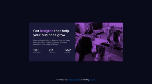
Submitted over 2 years agoA solution to the Stats preview card component challenge
CSS Flexbox, SASS/SCSS, Media Queries
sass/scss

@Tux3er-Isma
Solution retrospective
It was an easy challenge. Also you can practise media queries and css flexbox.
Code
Please log in to post a comment
Log in with GitHubCommunity feedback
- @catherineisonline
Hey, for the image to match the color, I did something like this, I hope that helps, size might not fit your solution but you can adapt it depending on your own code:
<div class="image-container">
img class="main-image" src="images/image-header-mobile.jpg" alt="">
</div>

.image-container {
  display: inherit;
  position: relative;
  width: 100%;
  border-radius: 0 10px 10px 0;
  background-color: hsl(277, 64%, 61%);
}
.main-image {
  width: 100%;
  height: 100%;
  position: relative;
  background-size: cover;
  border-radius: 0 10px 10px 0;
  mix-blend-mode: multiply;
  opacity: 0.75;
}
IF THIS WAS HELPFUL PLEASE MARK IT AS HELPFUL 🤩

Join our Discord community
Join thousands of Frontend Mentor community members taking the challenges, sharing resources, helping each other, and chatting about all things front-end!
Join our Discord