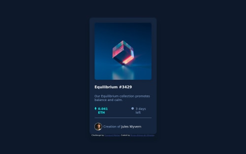
CSS Flexbox; Semantic HTML; Media Query

Solution retrospective
I had a hard time keeping the elements within the limit of their space, I ended up letting a padding pop out of the box
Please log in to post a comment
Log in with GitHubCommunity feedback
- @StormKing969
Hi.
When I looked at your css file, I saw a lot of hard coded sizes which make life harder when you want to make the website responsive. A quick fix would be to use "em", "rem", "vh" or "%" when defining sizes. In some place instead of using height or width to define the length of your container, use margin or padding to set the limits. You can also use "calc()". Use "px" sparingly.
Marked as helpful - @correlucas
👾Fala Bruno, tudo bem? Parabéns pelo desafio!
Acabei de ver sua solução e queria te deixar duas dicas:
1.Media query, nesse desafio aqui nem precisa usar media query, já que é só um card, bastaria você deixar o card responsivo substituindo as larguras de um valor fixo
width
paramax-width
desse jeito o card se ajusta de acordo com a tela.2.A imagem do NFT está perdendo as proporções fora do card, pra arruamar isso você precisa colocar
display: block
emax-width: 100%
pra fazer com que a imagem fique dentro do container e ajuste de acordo com a tela.img { display: block; max-width: 100%; }
Essa aqui é minha solução, se você quiser usar como referência: https://www.frontendmentor.io/solutions/nft-preview-card-vanilla-css-custom-design-and-hover-effects-b8D1k9PDmX
👋 Espero ter ajudado e continue no foco!
Marked as helpful
Join our Discord community
Join thousands of Frontend Mentor community members taking the challenges, sharing resources, helping each other, and chatting about all things front-end!
Join our Discord