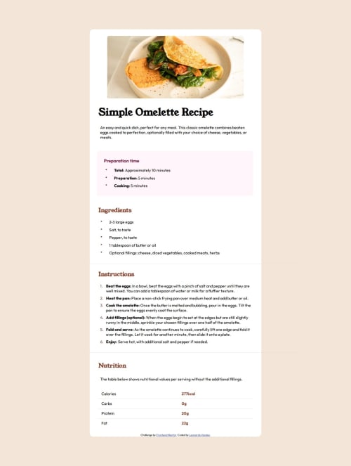
Solution retrospective
In this simple project I was able to learn a lot more, I learned how to change the list indicators, something I had no idea was possible.
What challenges did you encounter, and how did you overcome them?The main challenges were how to change the marker indicators and how to put a straight line on the page, especially within Nutrition, even though it seems simple, it was something that took me a while to figure out.
What specific areas of your project would you like help with?I believe that it is possible to make the site more responsive with much less code, something that makes it more flexible according to the size of the page.
Please log in to post a comment
Log in with GitHubCommunity feedback
- @YetiTheSleepingChancellor
Hey! @ChessUP Just wanted to say thanks — your CSS really helped me discover something I had been missing. I hadn’t used ::before with custom list styles before, especially for ordered lists using counter-increment and content, but your code showed me how to align numbers visually using position: absolute, and that helped me finally understand how to do it in my own layout. Much appreciated for that inspiration!
While going through your code, I also noticed a few areas you might consider refining for the best result:
Image Sizing: The image doesn’t use max-width: 100%, so it overflows on smaller screens. Adding that will make it responsive and stay within the card.
Font Weights: Some headings and body text have inconsistent or default font weights. You might want to review them — it looks like some are too bold or too light compared to the original design.
Text Color: You're likely using default black text in some places, but the style guide uses specific shades of grey. Using the provided color tokens will help the visual consistency. Worth double-checking that in the style guide.
Footer Placement: The “Challenge by Frontend Mentor / Coded by” section is currently inside the main card, which throws off the design balance. You might consider moving it outside the card so it doesn’t interfere with the clean box layout.
Again, appreciate how your approach helped me level up. Thought I’d share what I saw too in case it helps you refine yours further. Keep building strong!
- @thisisharsh7
Hi, great work on completing the challenge!
Some suggestions:
- You're right—your media queries can be more efficient. Instead of repeating full blocks of CSS, try using a mobile-first approach and only override specific styles at larger breakpoints.
- Consider wrapping sections like Ingredients, Instructions, and Nutrition in
<section>
tags for improved structure and accessibility. - Some values like margins and font settings are repeated across media queries. Consolidating these into base styles can reduce CSS redundancy.
- Instead of fixed
em
widths for images, use relative units like%
ormax-width: 100%
to improve scalability across devices.
Overall a good solution - happy coding!
- @NguyenPhuongtc
You should adjust the heading structure to follow the correct heading hierarchy.
Join our Discord community
Join thousands of Frontend Mentor community members taking the challenges, sharing resources, helping each other, and chatting about all things front-end!
Join our Discord