
Solution retrospective
Hi All,
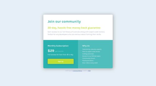
Again a next challenge (my 10th, yaay) using CSS grid for the first time. It didn't seem hard though I feel like I have too much typing in my CSS. Any advice on how I could shorten it somehow? Or does it seem okay?
Cheers to you all,
Dalma
Please log in to post a comment
Log in with GitHubCommunity feedback
- @matiasluduena23
Hi Dalma! Congratulation you finished the challenge!!! It looks really good! Just one advice.
- to add a hover effect in you button , use
button{ cursor:pointer ; transition: opacity 200ms ease-in-out }, and in youbuttton:hover { opacity: 0.7; }you can play with this number. Here you have an example using the background-color.
keep improving (;
Good code!!!
Matias
Marked as helpful - to add a hover effect in you button , use
- @Zy8712
The desktop version of your site looks pretty good. The only main changes I'd make is the breaking point of your website and the choice of having a scroll bar inside your container. Right now there is an awkward in-between on the desktop version, where certain screen sizes are too small for the container to fit (causing everything inside your container to shift), but the screen isn't small enough for your website to change to the mobile format which would be better.
Also to answer your question, your CSS is pretty minimal, so I wouldn't worry about it too much. Though one thing I'd remove is the redundant code I found in your style.css:
.subscription__price {
    color: var;
}
Besides that your site is pretty solid. Great work 👍
Marked as helpful


Join our Discord community
Join thousands of Frontend Mentor community members taking the challenges, sharing resources, helping each other, and chatting about all things front-end!
Join our Discord