Solution retrospective
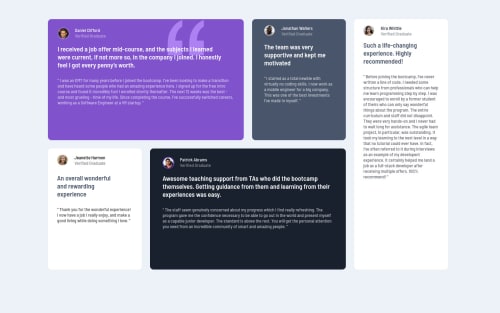
Hello, I have a question for community. I did this challenge using css grid, but I couldn't find how to set different sizes for two different columns in a different rows (container 1 at top and container 3 at bottom), so I implemented one extra non-display column, to use it for help to stretch the other two(using grid-column-star and grid-column-end). BUT in mobile size site, my last container (named : sidebar) is not as responsive as other 4, text goes out off container, so I had to stretch it manually, and I couldn't make any gap between last container and body background. Maybe someone have any advises how to fix this?
Please log in to post a comment
Log in with GitHubCommunity feedback
No feedback yet. Be the first to give feedback on uBsakuL's solution.
Join our Discord community
Join thousands of Frontend Mentor community members taking the challenges, sharing resources, helping each other, and chatting about all things front-end!
Join our Discord