CSS Grid Cards

Solution retrospective
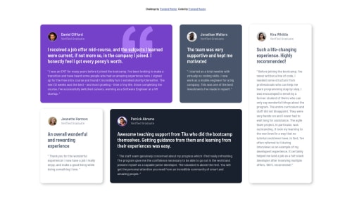
Great experience with CSS Grid. Mobile Responsive + Card Animation
Please log in to post a comment
Log in with GitHubCommunity feedback
- @grace-snow
Hey,
I see you had to use some
!importants in your css. Was that to overcome specificity issues? You'd probably find that's not necessary if you worked from a mobile-first approach and didn't nest selectors in css. Really, you want important to be reserved for trump helpers at the end of your css in a big project. They are very rarely used (for good reason) and shouldn't be needed on a solution like this reallyOne thing I notice in the html structure is you've made h2s come after h5s in each card. That's an invalid document structure. Heading tags have semantic meaning and need to go in order. You can still style with classes, but it's important for assistive tech users to structure headings in an orderly way.
Hope thats a good tip ☺
That all said, this is still a really nice looking clean solution with well organised and understandable code. I like the way you approach these callenges a lot. Keep going! 👍
- @ApplePieGiraffe
Hey, Front-end Master! 👋
Nice job on this challenge! The hover state you added to the testimonial cards is pretty cool and I like the way your solution responds! 👏
The only thing I might suggest is to change the color of the background of the page to match that of the original design. 😉
Keep coding (and happy coding, too)! 😁


Join our Discord community
Join thousands of Frontend Mentor community members taking the challenges, sharing resources, helping each other, and chatting about all things front-end!
Join our Discord