Skip to content
  • Unlock Pro
  • Log in with GitHub
Solution
Submitted almost 3 years ago

CSS Grid

sass/scss
Nikita Toropov•350
@tossik8
A solution to the Single price grid component challenge
View live sitePreview (opens in new tab)View codeCode (opens in new tab)

Solution retrospective


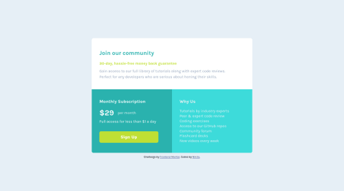
I used CSS grid for this task and came across a problem. When I made the grid layout for 375-px-wide screens I changed the number of columns to 1. For desktop devices I had 2 columns, and expected that setting grip-template-columns to 1 would change it. However, it did not work. All my sections are in 1 column as I intended them to be, but there is another column, which does not contain anything, and it creates extra redundant space on the right which I don't know how to remove. The question is, how do I remove that column?

Code
Couldn’t fetch repository

Please log in to post a comment

Log in with GitHub

Community feedback

  • Anton•515
    @antarya
    Posted almost 3 years ago

    Hi 👋,

    Good work on this challenge 🚀.

    CSS

    [1. Regarding your question. You have width: 50% on body main .elements which sets elements width to 50%. The grid works as expected; it is not an extra column but one with elements width set to 50%. In Chrome, there is a grid badge/toggle under the Elements tab of DevTools for the elements with display: grid; by toggling it, you will see the outline and additional info about the grid.

    • https://developer.chrome.com/docs/devtools/css/grid/#discover

    [2. Use CSS reset to have a good starting point, for example:

    • https://piccalil.li/blog/a-modern-css-reset/.

    [3. You will have issues if you customize styles for specific text lengths. You need to make a layout adaptable to any text length, as the length of the text is unpredictable. Start by removing fixed widths, allow elements to grow and restrict using (max|min)-(width|height) when needed; remove unnecessary margins.

    HTML

    [4. Do not use main tag as a wrapper of your panel, instead add div tag for your panel <main><div class='panel'>...</div></main> as a child of main tag.

    • https://www.w3schools.com/html/html5_semantic_elements.asp

    General

    [5. Take a look at a different approach where you first define default styles for narrow screens and add features for wider screens.

    • https://developer.mozilla.org/en-US/docs/Web/Progressive_web_apps/Responsive/Mobile_first

    [6. To name your classes consistently, check BEM, and to structure it in a reusable way, take a look at CUBE CSS. It will allow to reuse styles or make them easily customizable without deep nesting. Imagine a situation where you need to inject another element before body main .elements:nth-of-type(2) button { this will require changes that are not straightforward, compared to if you had .panel__subscribe button, or even better to style .button so it can be reused. Check these resources for additional information:

    • https://getbem.com/naming/
    • https://cube.fyi/
    • https://www.youtube.com/watch?v=NanhQvnvbR8

    I hope this will be helpful.

    Keep up the good work 🚀. Cheers!

    Marked as helpful

Join our Discord community

Join thousands of Frontend Mentor community members taking the challenges, sharing resources, helping each other, and chatting about all things front-end!

Join our Discord

Stay up to datewith new challenges, featured solutions, selected articles, and our latest news

Frontend Mentor

  • Unlock Pro
  • Contact us
  • FAQs
  • Become a partner

Explore

  • Learning paths
  • Challenges
  • Solutions
  • Articles

Community

  • Discord
  • Guidelines

For companies

  • Hire developers
  • Train developers
© Frontend Mentor 2019 - 2025
  • Terms
  • Cookie Policy
  • Privacy Policy
  • License

Oops! 😬

You need to be logged in before you can do that.

Log in with GitHub

Oops! 😬

You need to be logged in before you can do that.

Log in with GitHub

How does the accessibility report work?

When a solution is submitted, we use axe-core to run an automated audit of your code.

This picks out common accessibility issues like not using semantic HTML and not having proper heading hierarchies, among others.

This automated audit is fairly surface level, so we encourage to you review the project and code in more detail with accessibility best practices in mind.

How does the CSS report work?

When a solution is submitted, we use stylelint to run an automated check on the CSS code.

We've added some of our own linting rules based on recommended best practices. These rules are prefixed with frontend-mentor/ which you'll see at the top of each issue in the report.

The report will audit all CSS, SCSS and Less files in your repository.

How does the HTML validation report work?

When a solution is submitted, we use html-validate to run an automated check on the HTML code.

The report picks out common HTML issues such as not using headings within section elements and incorrect nesting of elements, among others.

Note that the report can pick up “invalid” attributes, which some frameworks automatically add to the HTML. These attributes are crucial for how the frameworks function, although they’re technically not valid HTML. As such, some projects can show up with many HTML validation errors, which are benign and are a necessary part of the framework.

How does the JavaScript validation report work?

When a solution is submitted, we use eslint to run an automated check on the JavaScript code.

The report picks out common JavaScript issues such as not using semicolons and using var instead of let or const, among others.

The report will audit all JS and JSX files in your repository. We currently do not support Typescript or other frontend frameworks.

Oops! 😬

You need to be logged in before you can do that.

Log in with GitHub