
Solution retrospective
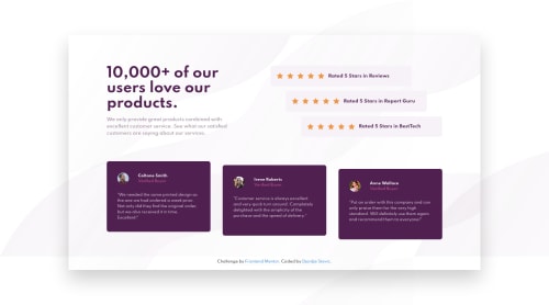
How should I make my grid responsive while still on higher resolutions before media queries?
Code
Please log in to post a comment
Log in with GitHubCommunity feedback
- @jones9411
hi @djokaras,
you have put the container width at 75%, this will be true on smaller screens as well, so the content within will over flow onto the rest of the page. try setting a min-width first then set a width that fits the content after. Also you need to use the background no-repeat fot the background images.
Marked as helpful

Join our Discord community
Join thousands of Frontend Mentor community members taking the challenges, sharing resources, helping each other, and chatting about all things front-end!
Join our Discord