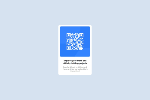
CSS grid, flexbox, CSS tricks, rem measurement for responsiveness

Solution retrospective
I haven't used CSS in a while, so I'm proud that I was able to recall the use of flexbox and grid, which can be tricky when you don't have enough practice. I also learned how to use rem as a measurement for responsiveness a while back and was glad that I was able to apply what I learned.
What challenges did you encounter, and how did you overcome them?I had a hard time vertically centering the container with the qr code on the page. I tried various methods using flexbox, but thanks to CSS tricks, I figured out that I needed to set the display of the parent container as a grid.
What specific areas of your project would you like help with?I would like to know if I was efficient with my CSS or if I was redundant. Could my CSS have been shorter?
Please log in to post a comment
Log in with GitHubCommunity feedback
No feedback yet. Be the first to give feedback on dee101-101's solution.
Join our Discord community
Join thousands of Frontend Mentor community members taking the challenges, sharing resources, helping each other, and chatting about all things front-end!
Join our Discord