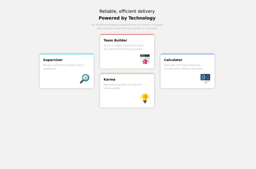
Submitted over 3 years agoA solution to the Four card feature section challenge
CSS Grid Template Area + BEM techniques used for responsive website
accessibility

@vikramvi
Solution retrospective
Dear Community,
This is my 2nd project which is implemented with help of CSS Grid Template Area + BEM techniques
Kindly review and give your valuable feedback on below
- width property usage, best practices
- deciding row sizes usage, best practices
- Any other areas of improvement as well.
Thanks in advance.
Kind Regards, Vikram
Code
Loading...
Please log in to post a comment
Log in with GitHubCommunity feedback
No feedback yet. Be the first to give feedback on Vikram Ingleshwar's solution.
Join our Discord community
Join thousands of Frontend Mentor community members taking the challenges, sharing resources, helping each other, and chatting about all things front-end!
Join our Discord