
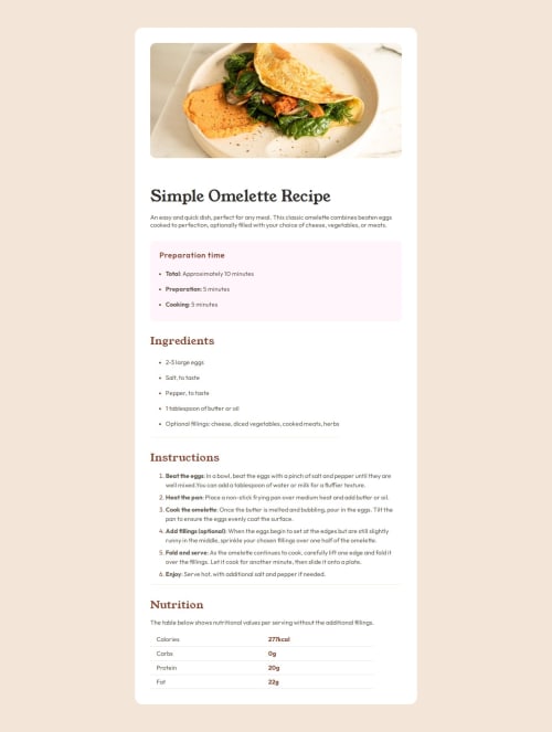
Solution retrospective
This is my first time trying rem instead of px, and I think it's a step forward for me. It's more beneficial for responsive layouts. Also, I used to really like the Grid layout, but this time I didn't use it entirely. Instead, I combined Flexbox and Grid layouts, and I'm happy to try more things. Additionally, I used global variables for all the colors with :root, and I found that really convenient.
I am not very proficient with media queries, and this time I encountered some issues while using them, which I managed to resolve. I will organize my notes and upload them to GitHub. Additionally, I don't use Flex very often, and this time I ran into a problem when applying a Flex layout to a ul element. Even though I used flex-wrap, the items still didn't wrap to the next line. This made me realize the importance of flex-direction, and I am glad to continue learning through practice.
Another thing is about modifying the marker before li elements. Previously, I avoided using li because I didn't know how to change the marker. This time, I tried using li and learned that I can use li::marker to alter the properties of the marker.
Also, regarding the <main> and <section> tags, this was my first time using them, and I gained a deeper understanding of their meanings.
Lastly, the letter-spacing property is something I rarely used before and had almost forgotten about. This time, I revisited letter-spacing and learned a lot from this exercise. Overall, I gained a lot from this practice session.
I'm not sure how well I'm using media queries. I also realize that I used to rely heavily on div and span elements, which probably isn't the best practice, right?
Please log in to post a comment
Log in with GitHubCommunity feedback
No feedback yet. Be the first to give feedback on arcueid-x's solution.
Join our Discord community
Join thousands of Frontend Mentor community members taking the challenges, sharing resources, helping each other, and chatting about all things front-end!
Join our Discord