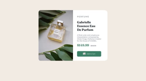
CSS/ HTML / Media Queries responsive

Solution retrospective
I was able to work on my media queries, and I used ChatGPT less than in previous projects. This project required 4 hours of work.
What challenges did you encounter, and how did you overcome them?Change the image based on screen size and properly size the images within the boxes. Work on the :active and :hover states in the correct dimensions. I used internet research for assistance.
What specific areas of your project would you like help with?I want to better understand how to properly integrate an image according to different formats; it’s not yet clear to me, and I often find the solution by chance. I'm not yet efficient with my work time and would like to know if I could be faster and how to achieve that, as well as work on the efficiency of properties. Feedback from the community on different image formats would be greatly appreciated. Thank you, everyone.
Please log in to post a comment
Log in with GitHubCommunity feedback
No feedback yet. Be the first to give feedback on jonathanPons's solution.
Join our Discord community
Join thousands of Frontend Mentor community members taking the challenges, sharing resources, helping each other, and chatting about all things front-end!
Join our Discord