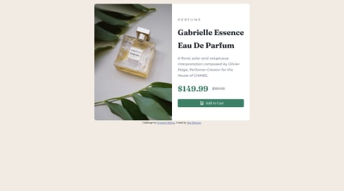
Submitted almost 2 years agoA solution to the Product preview card component challenge
CSS HTML

@Kiunga1
Solution retrospective
How can I add an appropriate media query for the mobile version? I'm unsure about my code for the different image application. Please give feedback on how I can improve.
 <picture>
        <source media="(max-width:768px )" srcset="images/image-product-desktop.jpg">
        <source media="(min-width:375px )" srcset="images/image-product-mobile.jpg">
        <img src="images/image-product-desktop.jpg" alt="Perfume">
Code
Loading...
Please log in to post a comment
Log in with GitHubCommunity feedback
No feedback yet. Be the first to give feedback on Ann Mukami's solution.
Join our Discord community
Join thousands of Frontend Mentor community members taking the challenges, sharing resources, helping each other, and chatting about all things front-end!
Join our Discord