css

Solution retrospective
thank you
Please log in to post a comment
Log in with GitHubCommunity feedback
- @Aysha-py
Hi ABDOYASSER111,
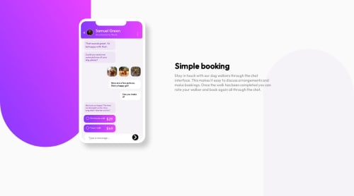
Welldone o n this challenge. I just check on my PC and I commend your effort in trying to get a near perfect design, but when I inspected on my PC to check other screen display, I notice it was not responsive.
My advice is that, you can try using display - grid and grid-template-column so that when you default to mobile you can give each grid 1fr, this is to help you segment your sections or make use of the flex display and make your flex-direction column in mobile, so that the 2 sections stacks on each other when you default to mobile view.
I also noticed you used a lot of absolute positioning, is there a reason for this?
Nonetheless, welldone and Happy coding!
Join our Discord community
Join thousands of Frontend Mentor community members taking the challenges, sharing resources, helping each other, and chatting about all things front-end!
Join our Discord