
Solution retrospective
I learned displaying flex more efficiently and learning how to center child elements more properly, with less code. Also proud of using much less thank in previous project.
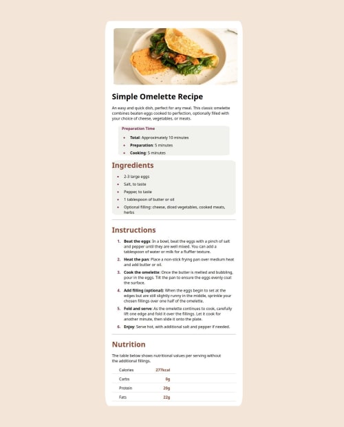
What challenges did you encounter, and how did you overcome them?Biggest challenge was organizing last part of this page, which is nutrition info. Because i used more than it is necessary and that complicated my solution.
What specific areas of your project would you like help with?With table organizations, inline elements.
Please log in to post a comment
Log in with GitHubCommunity feedback
- P@Stroudy
Amazing job with this! You’re making fantastic progress. Here are some small tweaks that might take your solution to the next level…
-
Using a
<main>tag inside the<body>of your HTML is a best practice because it clearly identifies the main content of your page. This helps with accessibility and improves how search engines understand your content. -
Using a full modern CSS reset is beneficial because it removes default browser styling, creating a consistent starting point for your design across all browsers. It helps avoid unexpected layout issues and makes your styles more predictable, ensuring a uniform appearance on different devices and platforms, check out this site for a Full modern reset
-
While
pxis useful for precise, fixed sizing, such asborder-width,border-radius,inline-padding, and<img>sizes, it has limitations. Pixels don't scale well with user settings or adapt to different devices, which can negatively impact accessibility and responsiveness. For example, usingpxfor font sizes can make text harder to read on some screens, Check this article why font-size must NEVER be in pixels. In contrast, relative units likeremandemadjust based on the user’s preferences and device settings, making your design more flexible and accessible. Usepxwhere exact sizing is needed, but prefer relative units for scalable layouts. If you want a deeper explanation watch this video by Kevin Powell CSS em and rem explained. Another great resource I found useful is this px to rem converter based on the default font-size of 16 pixel. -
Using
max-width: 100%ormin-width: 100%is more responsive than justwidth: 100%because they allow elements to adjust better to different screen sizes. To learn more, check out this article: responsive-meaning. -
Using
max-width: 100%ormin-width: 100%is more responsive than justwidth: 100%because they allow elements to adjust better to different screen sizes. To learn more, check out this article: responsive-meaning.
You’re doing fantastic! I hope these tips help you as you continue your coding journey. Stay curious and keep experimenting—every challenge is an opportunity to learn. Have fun, and keep coding with confidence! 🌟
Marked as helpful -
- @DAJ350
Well done learning about how to use flex to center child elements! You will find that's going to be a very convenient tool for positioning and sizing elements in a responsive manner moving forward.
I great step to improving this project would be looking into how to better match the font to the design file provided. There are a fews ways to do this. I'd advise taking a look into how to use websites like Google Fonts or Adobe Fonts or even how to use the @font-face property in CSS.
MDN @font-face documentation: https://developer.mozilla.org/en-US/docs/Web/CSS/@font-face
Marked as helpful


Join our Discord community
Join thousands of Frontend Mentor community members taking the challenges, sharing resources, helping each other, and chatting about all things front-end!
Join our Discord