custom properties , flex-box

Please log in to post a comment
Log in with GitHubCommunity feedback
- @Hassiai
Replace <div class="container"> with the main tag and <div class="card-body-title"> <p> with <h1> to fix the accessibility issues. click here for more on web-accessibility and semantic html
To center .card on the page using flexbox or grid instead of a padding, add min-height:100vh; display: flex; align-items: center: justify-content: center; or min-height:100vh; display: grid place-items: center to .container.
To center .card on the page using flexbox:
.container{
min-height: 100vh;
display: flex;
align-items: center;
justify-content: center;
}
To center .card on the page using grid: .container{ min-height: 100vh; display: grid; place-items: center; }For a responsive content which wont require a media query for this challenge, give .card a max-width value and increase the padding value for it to be equivalent to the design .
max-width:320px, padding:16px.There is no need to style .card-picture, give the img a max-width of 100% for a responsive image.
Give h1 and p the same font-size of 15px, text-align: center,the same margin-left, margin-right and margin-top values. Give p a margin bottom value.
Use relative units like rem or em as unit for the padding, margin, width values and preferably rem for the font-size values, instead of using px which is an absolute unit. For more on CSS units Click here
Hope am helpful.
Well done for completing this challenge. HAPPY CODING
- @MelvinAguilar
Hello 👋. Congratulation on successfully completing your first challenge 🎉 ! !
I have some recommendations regarding your code that I believe will be of great interest to you.
HTML 🏷️:
- Wrap the page's whole main content in the
<main>tag.
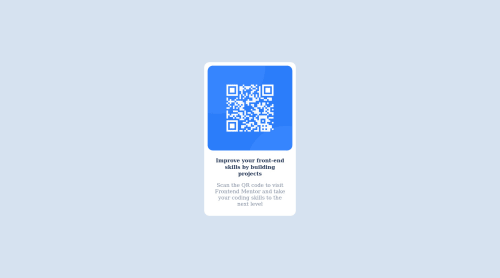
- Since this component involves scanning the QR code, the image is not a decoration, so it must have an
altattribute. Thealtattribute should explain its purpose. e.g.QR code to frontendmentor.io
CSS 🎨:
- There's no need to use media query in this challenge, you can use width and center the element in the base styles. Another tip is that the minimum width for a web page not to distort or lose content is 320px.
-
Use
min-height: 100vhinstead ofheight. Setting the height to 100vh may result in the background being cut off on smaller screens, such as a mobile phone in landscape orientation.
I hope you find it useful! 😄 Above all, the solution you submitted is great!
Happy coding!
- Wrap the page's whole main content in the


Join our Discord community
Join thousands of Frontend Mentor community members taking the challenges, sharing resources, helping each other, and chatting about all things front-end!
Join our Discord