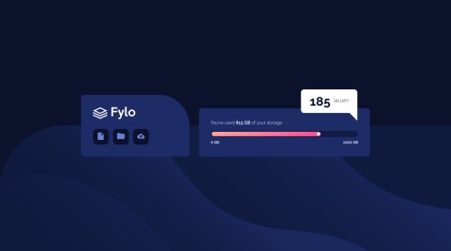
Data storage component with SASS

Solution retrospective
It looked very simple at the first sight. The main problem was how to add media query into the sass files.
Apparently not every property works like at the simple css. I used mixin with Breakpoint value=>
@mixin mobile-only { @media (max-width:#{$breakpoint-mobile}) { @content; } }
and for examples : width: 95%; // doesn't work flex-direction: column; //works
The only way I found how to apply it is to write at the EVERY selector (that I need to change for the mobile layout)
@include mobile-only {...}
It's definitely wrong, there are a lot of repetitions, but it works.
If you know how to make it more compact I would appreciate your advice
Please log in to post a comment
Log in with GitHubCommunity feedback
No feedback yet. Be the first to give feedback on NadiaFr's solution.
Join our Discord community
Join thousands of Frontend Mentor community members taking the challenges, sharing resources, helping each other, and chatting about all things front-end!
Join our Discord