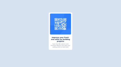
Design preview for the QR code component coding challenge html+css

Solution retrospective
Hello I just started to check and improve my skills with frontendmentor.io. My first project is to build out QR code component and get it looking as close to the design as possible using only HTML + CSS. My questions are: -Will my project show up in center of page in both mobiles and PCs, because i didnt specify width for any of them. I just used some sort of margins, paddings and flexboxes. If not what should I change or i guess add to make it work as it was told in instruction. -What should I focus on, when starting such project? I started on creating divs, header, and paragraph and then adding styles using css, im newbie in that and would appreciate some advanced programmers opinions. Thanks!
Please log in to post a comment
Log in with GitHubCommunity feedback
- @DavidMorgade
Hello Mateusz, welcome to the community and congrats on getting the first challenge done!
Let me try to answer the questions the best I can:
: -Will my project show up in center of page in both mobiles and PCs?
Working on desktop but failing in mobile, this is caused by the way you centered it, try not to use
positionto center the main elements from your layout, instead of that you could have use flexbox on the body, you just need to set themin-height: 100vhof the body, so it takes the whole browser screen, then with flexbox center your component.If you want to get this done in your project, first of all remove position, top, left, margins, height and widths from your body, also the
marginfrom your<div class='container'>.Then use flexbox in the body like this:
body {
    font-family: "Outfit", sans-serif;
    background-color: hsl(212, 45%, 89%);

    display: flex;
    justify-content: center;
    align-items: center;
    min-height: 100vh;
}
With this it will get centered in the screen for any type of syze!
What should I focus on, when starting such project?
Since you are starting out in CSS, just do it the way you are doing, create your html skeleton and then start adding styles trough classes, in the future you will find out that having some starting values as CSS variables for colors, sizes, weights will save you a lot of time, also having default values for your headings, paragraph, container... those are just utility class that you will just write on start because you are 100% sure that you are going to use them.
Hope my feedback helps you, if you have any questions don't hesitate to ask!
Marked as helpful - @Chaffexd
Hey Mateusz, a really good attempt at the challenge! Looks like you nailed it!
I would recommend a few things to answer your questions:
-
Personally, I wouldn't style the body with hard coded widths in px, it's better to use em/rem measurements for responsiveness. This article overs it pretty well (it's a short read): https://uxdesign.cc/why-designers-should-move-from-px-to-rem-and-how-to-do-that-in-figma-c0ea23e07a15
-
If you're concerned about something always being in the center, use flex! Flex is designed for positioning your divs. Instead of your margins, you could have just done: display: flex; justify-content: center; align-items: center; And then this way you've aligned items on the x and y axis without playing with margins.
To answer your question, the position of your element will remain the same since you've added those margins but it isn't the best approach. If you've got 15 mins: https://www.youtube.com/watch?v=fYq5PXgSsbE&ab_channel=WebDevSimplified Web Dev Simplified covers topics like flex and grid really well!
Look forward to seeing what you build next!
Marked as helpful -
Join our Discord community
Join thousands of Frontend Mentor community members taking the challenges, sharing resources, helping each other, and chatting about all things front-end!
Join our Discord