Not Found
Not Found
Not Found
Not Found
Not Found
Not Found
Not Found
Not Found
Not Found
Not Found
Not Found
Not Found
Not Found
Not Found
Not Found
Not Found
Not Found
Not Found
Not Found
Not Found

Submitted

Desktop and mobile for news home page

@Catalina-Hasnas

Desktop design screenshot for the News homepage coding challenge

This is a solution for...

  • HTML
  • CSS
  • JS
2junior
View challenge

Design comparison


SolutionDesign

Solution retrospective


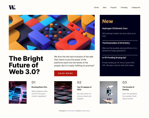
Had fun with this using grid-template-areas for this one, as it seemed like the best solution. I must admit, the images from the last section reaaally gave me some headaches as to how to make them the right size relative to the right side of the container they are in. Had to resort to using percent for that.

Community feedback

@VCarames

Posted

Hey there! 👋

Unfortunately, there are a lot mistakes that I would not expect at this challenge level... have you done any of the easier challenges?

Here are some recommendations for improving your code:

  • There's no need to create to different HTML codes for your header navigation. All you need is oneand you will use CSS to style them for different breakpoints.
  • To create the header for you site, you need to have a header element which will contain the logo and nav; It should also be outside of the main.
  • The nav toggle button should be the first thing inside of the nav followed by the nav menu which will be built using an unordered list.
  • The nav toggle button needs to be accessible, so it should contain an aria-label, aria-expanded and aria-controls.
  • For this challenge, the h1 heading is actually, visually hidden and it can only be used once per page ( you used it multiple times).
  • The aside and <div class="section-item"> should contain list elements.

There are still more things that need improvements...

If you have any questions or need further clarification, feel free to reach out to me.

Happy Coding! 👾

Marked as helpful

1

@Catalina-Hasnas

Posted

@vcarames

Thanks a lot for your feedback and for our dedication to help the community! I have implemented your suggestions and found them helpful to learn more about accessibility and semantic HTML.

I have a question that I would like to know your opinion on. If I had kept the separate html nodes as they were before, and instead added arria-hidden: true to the one that is not seen, would that have been a solution to the first point that you made here:

"There's no need to create to different HTML codes for your header navigation. All you need is oneand you will use CSS to style them for different breakpoints."

0

@VCarames

Posted

@Catalina-Hasnas

No. The issues was that you are repeating HTML code which is unnecessary as all it does it affect your sites performance and makes it difficult to maintain your code (especially as the site continuous to grow.... imaging if your site had thousands of lines of code).

In Web Development, you want to practice the DRY method to reduce code repetition/duplication to avoid redundancies.

0

@VCarames

Posted

@Catalina-Hasnas

I saw that your code has been update 🥳.

Here's more feedback to help out:

  • Any image that is purely decorative can have their alt tag blank; alt="".
  • For the aside, you will want to give it an aria-label to let users know what the section is about; "New" doesn't give proper details about it... so something like "New Articles" would suffice.
  • The "New" should be an h2 heading and the "Hydrogen VS Electric Cars", "The Downsides of AI Artistry" and "Is VC Funding Drying Up?" will all be h3 heading and also be wrapped inside anchor elements as they are meant to be click on.

<h3><a href="/">The Downsides of AI Artistry</a></h3>

  • The <button aria-label="read more">Read more</button> should be an anchor element as the "Read More" text most likely indicates that it will direct users to another page/section.

The aria-label="read more" is not needed as there is text in the button; the only time you would need that is if there is no text stating what the button is or does.

  • There should be a visually-hidden h2 heading in the <div class="section-item">.

  • "Reviving Retro PCs" and the other titles in the <div class="section-item"> are all headings and should be h3 along with their anchor element.

  • Keep your JS in a separate file to help with separation of concerns.
  • Unless you are using a bundler, keep all your CSS stylesheets in one file, as having multiple can have a serious affect on your sites performance.
  • In modern wed dev, it is best practice to build your sites mobile first as this will help with responsiveness and performance.
  • Remove the font-size: 15px from the html as it is bad practice and have negatively affect accessibility.
  • You also want to remove max-width: 1200px; from the body as you do not want to impose any limits on the body.

Marked as helpful

1

Please log in to post a comment

Log in with GitHub
Discord logo

Join our Discord community

Join thousands of Frontend Mentor community members taking the challenges, sharing resources, helping each other, and chatting about all things front-end!

Join our Discord