Desktop First Solution Using HTML CSS

Solution retrospective
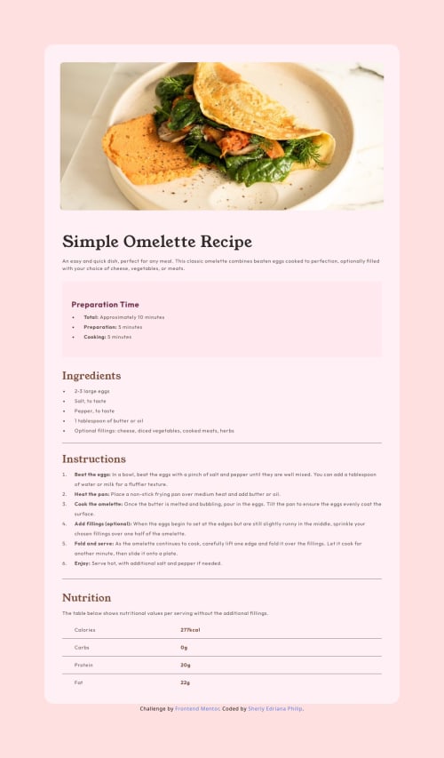
I developed a static recipe blog website using HTML and CSS. It took for about 1-2 days based on total hours that I was able to commit. But since my main goal is to recreate the website close to the design as closely as possible, so I focused on a desktop-first approach.
I implemented a desktop-first approach using media queries with max-width to make the site responsive. These are the breakpoints I used:
@media (max-width: 1024px) /* Styles for laptops and tablets */
@media (max-width: 768px) /* Styles for tablets */
@media (max-width: 480px) /* Common phones */
@media (max-width: 376px) /* small phones */
However, I need to deepen my understanding of CSS units such as %, px, rem, em, vw, vh to make the layout become more flexible and consistent.
Please log in to post a comment
Log in with GitHubCommunity feedback
- @Luzaliya
A job welldone

Join our Discord community
Join thousands of Frontend Mentor community members taking the challenges, sharing resources, helping each other, and chatting about all things front-end!
Join our Discord