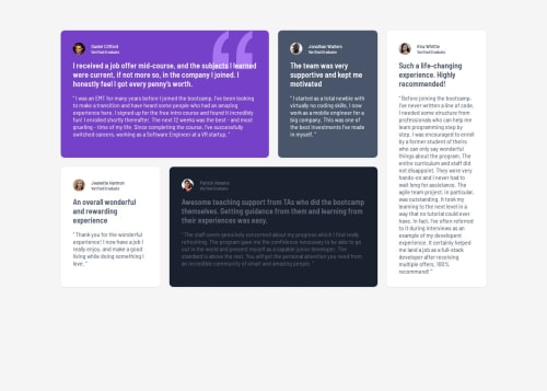
Desktop first testimonial section using css grid

Solution retrospective
I'm most proud of how the grid layout adapts responsively to different screen sizes, keeping the testimonials visually appealing and easy to read. Next time, I would plan a more mobile-first approach and consider using more CSS variables for spacing and breakpoints to make future adjustments easier.
What challenges did you encounter, and how did you overcome them?A key challenge was getting the grid areas to rearrange correctly at different breakpoints, especially for mobile. I overcame this by experimenting with grid-template-areas and testing the layout at each breakpoint. I also had to adjust color contrast for accessibility, which I solved by tweaking the color variables.
- Feedback on the responsiveness of the grid layout, especially on unusual screen sizes.
- Suggestions for improving accessibility (color contrast, semantic HTML, etc.).
- Best practices for organizing CSS in larger projects with many breakpoints and custom properties.
Any advice or code review in these areas would be greatly appreciated!
Please log in to post a comment
Log in with GitHubCommunity feedback
No feedback yet. Be the first to give feedback on Vedant Obaleppanavar's solution.
Join our Discord community
Join thousands of Frontend Mentor community members taking the challenges, sharing resources, helping each other, and chatting about all things front-end!
Join our Discord