Skip to content
  • Unlock Pro
  • Log in with GitHub
Solution
Submitted about 5 years ago

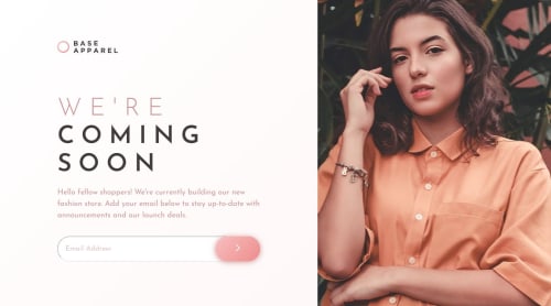
Desktop first using SASS

Dheyson Alves•220
@dheysonalves
A solution to the Base Apparel coming soon page challenge
View live sitePreview (opens in new tab)View codeCode (opens in new tab)

Solution retrospective


Hey there!

I use SASS in this project, was a bit challenged about some elements positioned between the mobile and desktop version. I got an issue in the mobile viewport, I couldn't put the logotype on the top. If anyone could help me with that, please :b.

Thank you.

Code
Select a file

Please log in to post a comment

Log in with GitHub

Community feedback

  • Martin•1,150
    @ringm
    Posted about 5 years ago

    Hi @Dheyson! Greay job on completing this one! It looks really good. I took the liberty of downloading your code and check it in detail, I have some ideas that could really improve your project.

    • You have nested all your styles inside media queries, I would advice you too try a mobile first approach. That means you code all the styles for the mobile design, and then just 1 or 2 media queries for specific breakpoints.

    • Regarding the media queries, I would advice you to always work with min-width, instead of max-width. Right now, you have set the destkop styles with a media query that works for devices with a max-width of 1920px. What happens when the site is opened on a screen that has a resolution bigger than 1920px? There are no styles defined and the site breaks. Try doing a mobile first approach and you will definetly avoid this issues.

    • I checked the css file and you have too many nested selectors, some goes 6 or 7 levels deep! That's totally not reccomended, you should always avoid specificity when possible. In your case in particular much of this selector aren't doing anything.

    For example, this code:

    .container .information .form button:hover, .container .information .form button:active, .container .information .form button:focus {
      opacity: 0.5;
      box-shadow: 0px 5px 20px #ce9797;
    }
    

    And this code:

    .form button:focus {
      opacity: 0.5;
      box-shadow: 0px 5px 20px #ce9797;
    }
    

    Work exactly the same, however, the second one is much cleaner and easy to read. Try removing all the nesting selector when possible.

    I think if you implement this changes you'll fix most of you layout problems. Keep it up! I'm looking forward on seeing your next projects :D

  • Dheyson Alves•220
    @dheysonalves
    Posted about 5 years ago

    Hey @ringm! thank you very much for taking the time to reply. So great to read feedback, definitely gonna check. And thank you for warning me about this nested CSS, it got really huge. I got your point about the resolutions and media-queries, gonna check those.

    Thank you :b!

Join our Discord community

Join thousands of Frontend Mentor community members taking the challenges, sharing resources, helping each other, and chatting about all things front-end!

Join our Discord
Frontend Mentor logo

Stay up to datewith new challenges, featured solutions, selected articles, and our latest news

Frontend Mentor

  • Unlock Pro
  • Contact us
  • FAQs
  • Become a partner

Explore

  • Learning paths
  • Challenges
  • Solutions
  • Articles

Community

  • Discord
  • Guidelines

For companies

  • Hire developers
  • Train developers
© Frontend Mentor 2019 - 2025
  • Terms
  • Cookie Policy
  • Privacy Policy
  • License

Oops! 😬

You need to be logged in before you can do that.

Log in with GitHub

Oops! 😬

You need to be logged in before you can do that.

Log in with GitHub

How does the accessibility report work?

When a solution is submitted, we use axe-core to run an automated audit of your code.

This picks out common accessibility issues like not using semantic HTML and not having proper heading hierarchies, among others.

This automated audit is fairly surface level, so we encourage to you review the project and code in more detail with accessibility best practices in mind.

How does the CSS report work?

When a solution is submitted, we use stylelint to run an automated check on the CSS code.

We've added some of our own linting rules based on recommended best practices. These rules are prefixed with frontend-mentor/ which you'll see at the top of each issue in the report.

The report will audit all CSS, SCSS and Less files in your repository.

How does the HTML validation report work?

When a solution is submitted, we use html-validate to run an automated check on the HTML code.

The report picks out common HTML issues such as not using headings within section elements and incorrect nesting of elements, among others.

Note that the report can pick up “invalid” attributes, which some frameworks automatically add to the HTML. These attributes are crucial for how the frameworks function, although they’re technically not valid HTML. As such, some projects can show up with many HTML validation errors, which are benign and are a necessary part of the framework.

How does the JavaScript validation report work?

When a solution is submitted, we use eslint to run an automated check on the JavaScript code.

The report picks out common JavaScript issues such as not using semicolons and using var instead of let or const, among others.

The report will audit all JS and JSX files in your repository. We currently do not support Typescript or other frontend frameworks.

Oops! 😬

You need to be logged in before you can do that.

Log in with GitHub

Oops! 😬

You need to be logged in before you can do that.

Log in with GitHub