Desktop-first approach with Webpack | SASS | Babel

Solution retrospective
So, this one was a mixture of feelings, rsrs.
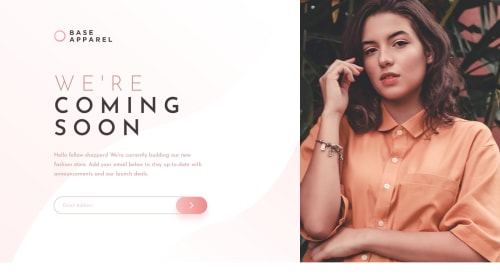
I would LOVE feedback on my media queries because I took a desktop-first approach and I REALLY struggled with the mobile layout. For this project I tried to go the extra mile in some aspects, and I used Webpack, SASS and Babel (as transpiler). It was really fun do set all these things up and have a more realistic idea of a real project, feedback on this setup would also be highly appreciated.
The active states didn`t specify anything to be done in case of a valid email, so I threw an alert message and changed the border of the form, just to provide a visual confirmation that the email was accepted.
Is there any other way I could`ve set the height? I had to hard code it because there was an annoying gap below the whole screen...
Anyway, thanks for taking the time to check my solution!
Please log in to post a comment
Log in with GitHubCommunity feedback
No feedback yet. Be the first to give feedback on Tobias Sirianni Melo's solution.
Join our Discord community
Join thousands of Frontend Mentor community members taking the challenges, sharing resources, helping each other, and chatting about all things front-end!
Join our Discord