


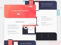


Hi @yuenu - lovely work on this one 🙌 I found this one quite tricky, especially the images and dropdown menus.
One thing you might want to think about stopping the page from spreading too wide a very large screens. There are many ways to do this but I set a grid on the body element, with three columns, as using a class selector as follows:
.center-content {
	display: grid;
	grid-template-columns: minmax(1rem, 1fr) minmax(375px, 1440px)minmax(1rem, 1fr);
}

.center-content > *  {
	grid-column: 2;
}
The 1440px is the max-width you want the main content to be, and the 1rem values is the smallest spacing you want either side of the main content on small screens (I sometimes put this to 0 and use a container to add padding to each section).
The second part positions all direct children of the body in this nicely sized middle column. In my case, mostly, my header, main, and footer the middle column, and stops them going wider than 1440px. It’s also pretty easy to ‘break’ elements out of this constraint if you need to.
Other people use container classes to do the same thing. This article has a good run down of alternative approaches https://css-tricks.com/the-inside-problem/ You will note I am actually using the approach the author doesn't like!
Either way it's a good idea to find an approach that works for you as you'll need this for a lot of FEM challenges.
Another thing, is your outline styles, you've done good by using a button to open the dropdown navigations, but if you remove outline styles then it is important to add back in your own custom outline styles as otherwise it can make it very hard for keyboard users to navigate the page.
If you don’t like the default styles I have found the advice in this article very useful, and use it in pretty much all my projects: https://css-tricks.com/the-focus-visible-trick/
/* Add styled focus states on tab not hover */

:focus-visible {
  outline: 3px dotted currentColor;
  outline-offset: 0.25rem;
}

:focus:not(:focus-visible) {
  outline: transparent;
}
Hope this helps and keep up the good work!! 👍
Cheers 👋
Dave
@yuenu
Posted
@dwhenson
I appreciate your suggestion very much, it's really helpful to me

